One of the ideas I had was to use a photo I took of the newspaper articles which were used as props in our trailer production. This would have provided another link between my campaign products. After careful consideration and comparison I decided that this would not be a suitable background as it had to much going on for a background used on a ‘Sight and Sound’ magazine cover.

I then went to the next extreme and tried out a plain black background. The reason in which I choose black for the colour of the background is in relation to the genre of our film trailer. The colours black and red are both common traits of our chosen genre horror and I felt it would be appropriate to continue these conventions on into my magazine cover. However I decided not to use this background because it was too plain and made the magazine cover layers look to separate.

I then experimented with the colour red as a background but it didn’t have the correct effect that I was looking for. It rather connoted the idea of passion.
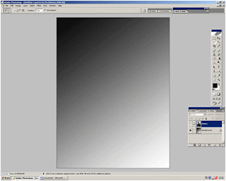
It was from here that I remember that when using Photoshop there was a gradient tool which would be able to fade the colour. I first tried this with the black background and found that with the black fading to white was most effective. The reason for this being that there is very little going on in the background but it is not completely plain.


No comments:
Post a Comment