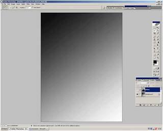
I started to create my magazine cover by opening up Photoshop and then going to file and then new. From here I proceeded to create my background. The way in which I did this was by using the paint bucket tool to fill the whole page black. I then made it fade from black to white was by using the gradient tool. I chose to have my background darker in the top left and then fade diagonally down. The reason for this is that I wanted my magazine cover to be mostly dark. This is a key convention of the genre horror. Also if fading the other way the photograph covers most of the dark colour and gives the magazine cover a different effect. Furthermore I chose the fade to be diagonal because it was most aesthetically pleasing.
Once I was satisfied with the background I then inserted the photograph which I had chosen to use as the main picture. It soon became evident that I would need to edit the photograph. The first thing I did was to use the magic wand tool to erase the upper half of the staircase as well as the photos original background. This was fairly simple due to the fact that the original background was cream whi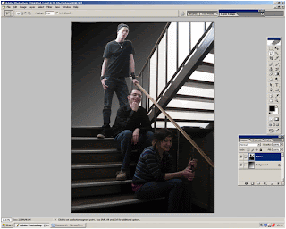 ch contrasted with the subjects and I knew from previous experience using Photoshop that a plain background made the use of the magic wand more effective.
The reason in which I erased the original background and upper staircase was because it would have been too large. Moreover I intended to crop my image and to do so effectively it was necessary for me to delete the background. Additionally to have used my original photograph background would have gone against the codes and conventions of ‘Sight and Sound’. I further went on to adjust the image’s size so that the character was not being covered up by the magazines title and place it on the left of the magazine cover. It is not a convention of ‘Sight and Sound’ to overlay the image on top of their brand name, so I avoided this.
My next step was to create a layer with the title and logo on. I obtained these images from the Internet and saved them to my pictures. I then opened them in Photoshop and used the magic wand tool to delete the background through the use of the inverse tool. The same process was used when developing the layer which contains the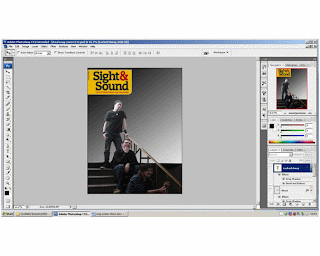 blood stain image which I also obtained from the Internet. I decided to use images from the Internet because they looked most effective and made my magazine cover look more professional. From examining front covers of ‘Sight and Sound’ I noticed that films with the genres horror or thriller did have specs of blood on them if it were appropriate. I felt that because our trailer depicts a knife as a weapon it would therefore be an appropriate code and convention to use on my own magazine cover.
I then went on to use the text tool in order to include the headlines. I have them set out so that they decrease in size as they descend down the page. I have settled on two styles of fonts and I use the serif for the headline and the non serif font as the sub heading. It is a convention of Sight and Sound to use a variety of serif and non serif fonts. To add to this all of the headlines are down the left hand side of the page, this is a convention of ‘Sigh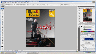 t and Sound’ another one is that they have considerable fewer headlines when compared to their competitors products such as ‘Empire’. After deciding where I would place the text and in what font I began to experiment with different effects. I have decided to use a drop shadow on the title of the film ‘Locked Away’ because it makes the text appear more 3D giving the magazine cover texture. Additionally I have used the bevel and emboss effect on the title ‘Locked Away’ because it to adds to the effect of being 3D adding texture.
Once I was satisfied with the background I then inserted the photograph which I had chosen to use as the main picture. It soon became evident that I would need to edit the photograph. The first thing I did was to use the magic wand tool to erase the upper half of the staircase as well as the photos original background. This was fairly simple due to the fact that the original background was cream whi
 ch contrasted with the subjects and I knew from previous experience using Photoshop that a plain background made the use of the magic wand more effective.
The reason in which I erased the original background and upper staircase was because it would have been too large. Moreover I intended to crop my image and to do so effectively it was necessary for me to delete the background. Additionally to have used my original photograph background would have gone against the codes and conventions of ‘Sight and Sound’. I further went on to adjust the image’s size so that the character was not being covered up by the magazines title and place it on the left of the magazine cover. It is not a convention of ‘Sight and Sound’ to overlay the image on top of their brand name, so I avoided this.
My next step was to create a layer with the title and logo on. I obtained these images from the Internet and saved them to my pictures. I then opened them in Photoshop and used the magic wand tool to delete the background through the use of the inverse tool. The same process was used when developing the layer which contains the
 blood stain image which I also obtained from the Internet. I decided to use images from the Internet because they looked most effective and made my magazine cover look more professional. From examining front covers of ‘Sight and Sound’ I noticed that films with the genres horror or thriller did have specs of blood on them if it were appropriate. I felt that because our trailer depicts a knife as a weapon it would therefore be an appropriate code and convention to use on my own magazine cover.
I then went on to use the text tool in order to include the headlines. I have them set out so that they decrease in size as they descend down the page. I have settled on two styles of fonts and I use the serif for the headline and the non serif font as the sub heading. It is a convention of Sight and Sound to use a variety of serif and non serif fonts. To add to this all of the headlines are down the left hand side of the page, this is a convention of ‘Sigh
 t and Sound’ another one is that they have considerable fewer headlines when compared to their competitors products such as ‘Empire’. After deciding where I would place the text and in what font I began to experiment with different effects. I have decided to use a drop shadow on the title of the film ‘Locked Away’ because it makes the text appear more 3D giving the magazine cover texture. Additionally I have used the bevel and emboss effect on the title ‘Locked Away’ because it to adds to the effect of being 3D adding texture.
No comments:
Post a Comment