The first thing I did after opening Photoshop was to go to new and set the settings to 800x800 as this is the size that a professional webpage would be designed on. Much of my pre production informed me that general codes and conventions for the genre horror should be applied to the website. With this in mind it formed the basis for the reason in which I chose to make the background black which further went on to influence the overall colour scheme of the webpage. To turn the background black I used the paint bucket and it gave me a block colour. 
I then opened up my chosen picture and made it black and white using the greyscale. The reason I did this was because it made the shine of the blade of the knife more prominent. Additionally when photographs are in black and white it desexualises the photograph and makes the audience pay more attention to the finer detail of the picture. I then used the elliptical marquee tool and made a circle around the part of the picture I wished to use.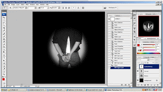 I subsequently had to change the feathering so that the picture merged with the background. I was particularly pleased with this effect and felt that the on the whole it was appropriate for the genre of the film as an accompanying product.
I then decided to include the title of the film. The rule of thirds influenced its positioning on the page because I needed to represent its importance in relation to the other information on the page. Furthermore again because I wanted to demonstrate the title of the films importance on the page I made the title a contrasting colour so that it stands out. Additionally I applied the bevel and emboss effect in order to give the title a 3D effect. This makes the title jump off the page and eye catching for the audience. This should aid the audience in remembering the title of the film.

I then opened up my chosen picture and made it black and white using the greyscale. The reason I did this was because it made the shine of the blade of the knife more prominent. Additionally when photographs are in black and white it desexualises the photograph and makes the audience pay more attention to the finer detail of the picture. I then used the elliptical marquee tool and made a circle around the part of the picture I wished to use.
 I subsequently had to change the feathering so that the picture merged with the background. I was particularly pleased with this effect and felt that the on the whole it was appropriate for the genre of the film as an accompanying product.
I then decided to include the title of the film. The rule of thirds influenced its positioning on the page because I needed to represent its importance in relation to the other information on the page. Furthermore again because I wanted to demonstrate the title of the films importance on the page I made the title a contrasting colour so that it stands out. Additionally I applied the bevel and emboss effect in order to give the title a 3D effect. This makes the title jump off the page and eye catching for the audience. This should aid the audience in remembering the title of the film.
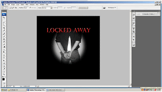
The next step was to decide on the links that I would include on my webpage. The reason in which I decided on the ones that I have relates to the type of audience I am trying to attract. By including a link about the cast and crew demonstrates the fact that the audience members who go and see a film because of who directed it or because of who is starring in it are part of my target audience. Links such as news and downloads appeared a number of times on websites which I researched and as a result of this I decided to use them. In order to create a professional aspect to my website. The colour I have chosen and the font makes these links stand out enough for an audience member who is just browsing to stop them easily however I have not applied any effects because I don’t want them to become too dominant on the page.
After that I decided to use the shape tool to draw straight lines which appropriately encased the links. This again had the effect of making my website look more professional and it further gives the effect of a button. Which essentially I have included because one objective of my website is to inform the audience about the film ‘Locked Away’ and it encourages them to click on the link to find out more. Once I had drawn a set of lines which I was happy with I used the option copy to recreate each line which ensured that they were all identical.
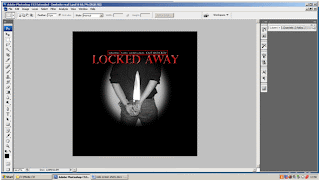
Following this is the proceeded to create the credits at the bottom of my webpage. Like all of the text based information on my webpage I used the text tool to create it. I used a non serif font for the credits because such a font was featured on a number of web pages that I researched. Indicating that it is a convention of websites designed to advertise a film. I originally had the text colour as white however I thought that it was to bright against the black background. I experimented with the colour grey but this didn’t look right either. In the end I applied a bevel and emboss effect as well as an inward shadow and this produced my end result which I am pleased with as it dulled the colour of the credits. Making these credits took longer than I had expected because I decided to develop a style which I had seen used on one of case study materials. This meant that I had to create each word on a separate layer.
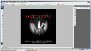
Once I had completed the credits and I was happy about where they were placed I decided to include social networking sites logos in order so audience members could follow the film. Much research has suggested that social networking sites are common places for a collective identity to develop. As it provides audience members with a forum to express ideas and opinions.
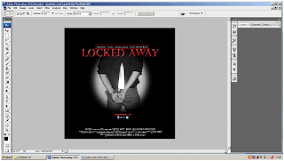
When taking a look at my webpage I felt as though something was missing. Reconsidering my case study materials it appeared to that the use of a slogan was a common convention featured on websites advertising films. It was here that I decided to include one of my own. I decided to use one of the voiceover slogans ‘someone must pay’ and incorporated it onto my webpage. I used the text tool to create it and decided to stick to the colour codes which I had developed for the website. I then used the bevel and emboss effect on the slogan again further creating links to the rest of the website.


No comments:
Post a Comment