
FHM Website
The practice magazine cover that I produced was designed in another workshop designed to give more practice and therefore confidence when using the programme Photoshop. To start with we were required to pick a picture and from that pictures codes and conventions we needed to decide on an appropriate pre existing magazine title to style it on.
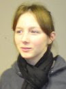
The picture in which I choose was that of a white, young and able bodied woman. I felt that this picture would be most appropriate used on an FHM cover. Other reasons for this decision include the fact that the women is scantily dressed and is posed in a seductive manner. FHM, originally published as For Him Magazine, is an international monthly men's lifestyle magazine. The target audience for such a magazine is young males aged 18 years old to 25 years old.
Such a picture is also appropriate as according to Louis Althusser magazines rely on the idea of interpellation. Whereby the magazine calls out to its audience as they feel they can identify with what is being represented to them. In relation to my picture chosen for the magazine cover the audience believes that the young woman is calling out to them.
From examining my stimulus texts it revealed that the backgrounds behind the models were normally plain with very little happening. The reason for this being that the magazine producers want the audience’s main focus to be on the model not the background. Due to this I decided that it would be appropriate to cut the model out from her original background as it was fairly crowded. I did this on Photoshop using the wand tool to cut around her body shape and then creating another layer as the background
Once this was decided and complete I next had to think about what colour the background behind the model should be. From observing my stimulus texts it became apparent that the colour red was a popular theme. The reason for this being that the colour red is commonly associated with passion.
In addition I noticed that although for the majority of the time the backgrounds were simple they themselves where not a single block colour. Through the use of Photoshop I was able to have a darker colour red reducing to white diagonally across the page. Giving my magazine cover some texture.
Next on the agenda was to find a similar font to that used by FHM for their title. Although I realise that it would be extremely hard to find an exact match to the font. As it is likely FHM have paid a designer to create it for them as their trade mark however there are certain things in which you can look out for in order to find something similar. The reason in which I decided to use the font style for my title is because it has very alike angles to that of FHM’s font and to add to this the title font is san serif just like the actual FHM title.
Furthermore something else which must be taken into consideration with regards to the title is the colour of it. Essentially from my case study material there appeared to be no generic colouring for the title. However the title was always in contrast to the background making it stand out. That is why I chose to use the colour white as it made the title clear and easy to read against a red background. Moreover atheistically it was pleasing to the eye as the background itself descends into white. On the magazine cover a colour code was emerging.
One personal touch which I included was the price sticker although featured on some stimulus material I decided that instead of making it look like a sticker I would design it to look like a button, as FHM is commonly associated with gadgets.
Something else which became apparent when examining the stimulus material was that the headlines included on the magazine cover needed to be short and catchy. Anne Cronin suggests that magazines rely on the concept of the narrative of the self. In the sense that the headlines must entice them to believe that if they buy it they can become it. In relation to my magazine cover headlines such as ‘are you man enough 10 ways to please her’ entice the reader to buy the magazines as they wish to be able to please the model on the front. Again the magazine cover is representing something in which they wish to be able to do or become. Michel Foucault argues that it is less to do with the narrative of the self and more to do with the technologies of the self. He suggests that such technologies of the self as rituals means that because the audience identifies with the magazine they will openly consume its contents because they identify with the representations portrayed to them as factors in their lives.
Additionally something else which was becoming apparent from my case study material was the colour codes used for texts along with the size of the font. All of the writing on my magazine cover follows these established codes.
Also all the textual information provided on my magazine cover is on the right and not overlaying onto the model. As with all of the FHM covers studied there is no writing over the main focus of the picture. If for one reason or another this is unavoidable then the text is placed under the picture. The reason for this being that the model is the main focus point. This is also the reason in which the model on my cover is placed on the left hand side to represent the pictures dominance over the audiences focus.
No comments:
Post a Comment