Initially the pre productions for my individual coursework task started a number of months ago as my lecturer ran a few workshops for the class on how too use Photoshop.
With the main part of my magazine pre production underway I have began to develop my ideas into the product using the software programme Photoshop. It was during the pre production that I decided that the best already existing magazine to use as a style model would be ‘Sight and Sound’ So far I feel that what I have produced is coming along really well and the only problems in which I have encountered are due to my inexperience using the software. Which are easily resolved through either experimenting or by asking my lecturer specific questions about how to do it.
The pre production for my magazine cover has taken longer than I would have anticipated. The reason for this being as I examine my case studies I am bombarded with many codes and conventions and I find that I am not short on things to say. I feel the reason in which I am able to identify such things so easily is due to my previous study of magazines with regards to theorist. Form this information obtained I have been able to draw a draft of what I expect my magazine cover to turn out like. I am aware that some of my ideas may not be possible however I wish to stick as closely to my draft as possible. As I feel that through the research which I have done I have been able to make informed decisions which should produce the best effects.
It was at some point during the pre production stage that I decided on what sub titles I would include on my magazine cover. This involved me identifying a lexical style in which the Sight and Sound magazine used. It was noticed by me that Sight and Sound used very few sub titles however the ones which were included were vital to lure the target audience. One thing in which I did note with regards to sub titles was the fact that they used people’s names to inform the reader of who had written the article inside or who it featured.
I have completed an ideas blast of things which I need to include on my own magazine cover as part of its development as well as a SWOT analysis which has highlighted threats and weaknesses which I need to try and overcome in order for my magazine cover to be successful.
Wednesday, 31 March 2010
Sight and Sound
‘Sight and Sound' is my chosen magazine in which I will produce a magazine cover for my viral campaign. The reason for such a decision is the fact that ‘Empire’ magazine mainly focus on big blockbuster movies from Hollywood and my production is more likely to be produced by a small media institution such as BBC-Film who like the BFI (British Film Institute) are funded publically and hold a duty to provide reviews on a wide variety of films. Both BBC-Film and the BFI have a lot to do with social realist films and although our film is not directly a social realist film it does contain some controversial issues. For example our synopsises of the film in which we are producing a trailer for is that teenagers get locked in at college one night after studying late where they are then attacked by a caretaker. The controversial issue being that within society recently there have been a number of cases whereby members of authority have abused there powers. It can be said that ‘Sight and Sounds’ target audience are slightly older than those of ‘Empires’ target audience. This is especially appropriate to our film as it holds a certificate 15 due to some of the violent content. This also relates to the fact that it can be said that ‘Sight and Sound’ readers hold an air of maturity and this too would be required within our target audience in order for them to fully appreciate what is being represented to them.
Additionally with regards to mise-en-scene the photograph which I decided to use was most suitable to be featured on a ‘Sight and Sound’ cover as it features 3 people facing the camera in costume but not necessarily in character. To add to this the dull effect of my photograph also matched some of the codes and conventions featured on a ‘Sight and Sound ‘magazine.
Additionally with regards to mise-en-scene the photograph which I decided to use was most suitable to be featured on a ‘Sight and Sound’ cover as it features 3 people facing the camera in costume but not necessarily in character. To add to this the dull effect of my photograph also matched some of the codes and conventions featured on a ‘Sight and Sound ‘magazine.
Magazine Research
The two magazines in which I decided to examine as part of my research for my magazine cover are ‘Empire’ and ‘Sight and Sound’ these are two popular film magazines published within the UK. The fact that they are published in the UK is an important factor into the reason in which I chose them to examine. The reason for this being that my target audience for the trailer are British and are therefore likely to consume a British publication. The things in which I will be looking for on the editions are codes and conventions which feature regularly on the magazines.
Empire
Empire magazine is produced by Bauer Consumer media and is Britain’s most popular film magazine. They tend to stick to main stream films which have generated the most media hype at the time. They focus mainly on the entertainment factors. Codes and conventions in general which occur over and over again on almost all issues of ‘Empire’ which I have noted are the fact that the title of the magazine is always in the same style of font regardless and almost always in the colour red. All fonts included on ‘Empire’ front covers are son serif fonts. The reason for this being that Bauer Consumer media have built themselves a respected brand which is recognised for its title. It has also been distinguished that the title is always placed at the top reading form left to right which is a common occurrence on many magazine covers produced for a western culture. Furthermore it is strategically placed there with regards to the rule of thirds and the power structures on the page. Additionally the magazine covers normally feature the main character of the film in a posed position placed on an active background background. This normally holds ties with the films genre. It is the film in which the character is featured in which sets the theme of the cover. This is normally based around the preconceived codes and conventions of genre. Additionally there are never more than 3 actors featured on the magazine cover at one time and traditionally it would appear that no props are used. Most of the time above the name of the magazine ‘Empire’ there is a statement made which links into the brand to make a sentence. For instance ‘Wolverine has returned for…EMPIRE’. One reason for this may be to create a sense of exclusiveness to ‘Empire’ as a magazine. Making the audience think that they have to buy it as they won’t be able to find anything like it in other competitor production.
My research into ‘Empire’ magazine has lead me to examine three different editions the first one being (January 2009 wolverine) one thing that strikes me instantly is the fact that the main character within the film is placed so he is overlapping the title. When considering other issues if this happens then the character is only ever entirely placed over the letter P of the title over letters may be covered but only slightly. Essentially the reason for this is the fact that even with the letter ‘P’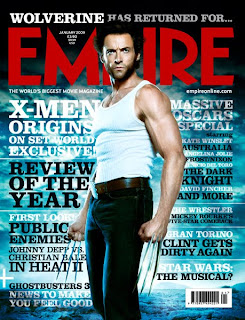 covered it is still possible to identify what magazine it is. The photo taken of the character is that of a mid long shot as you can see all but the bottom half of his legs. The reason for this being that the previous story line was that he was a mutant developed from human form. This picture demonstrates through mise-en-scene that he looks very similar to that of a human form. Another characteristic which strikes me is the fact that each cover features an actor from which ever film they are trying to exhibit in character in a posed position looking directly at the camera. Taking Althussers theory of interpellation into account this is an attribute of all ‘Empire’ magazines with regards to it calling out to its audience who subsequently go and buy it. This is the chief aim of the magazine producer. The sub head lines on the exemplar material are positioned both on the left and the right of the character. With the most important part of the information in a larger font and then almost a follow up summary beneath. However the titles positioned on the right hand side of the character are that of a smaller font which suggests there lesser importance as well as there position on the page with regards to the rule of thirds.
The next cover in which I studied was (September 2008 watchmen)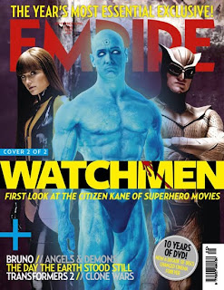 which confirms many of my previously assumed codes and conventions of the ‘Empire’ magazine. Although there are a few notable differences such as this cover features the maximum amount of 3 characters on the page. Throughout my research I have come across no editions with more than 3 characters featured. In comparison to the (January 2009 wolverine) edition it has very few sub headlines. The reason for this is because with 3 characters on the page there is already a lot going on. The main sub title used relates directly to the film visually advertised. Whereas the (January 2009 wolverine) edition has many captions not all of which are directly related to the film being advertised. The (September 2008 watchmen) again confirms the use of long mid shots as a convention of ‘Empire’ however I feel reason for this varies with regards to the previous example. I believe that the reason in which a mid to long shot has been used for this photo is to portray the characters power relationships with each other. As fundamentally with regards to the rule of thirds when applied to a magazine it would appear that the female character holds a large degree of power due to her position on the left of the page. However the centre and right positioned characters have the majority of their torsos showing which is an indication of their power as the left hand character is stood in a side position and you can see very little of her in comparison. Furthermore the centre character would appear to hold the most power as he is dominating the picture.
The last edition of ‘Empire’ in which I examined was the (January 2007 Spiderman)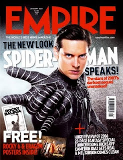 which once more did confirm many of the codes and conventions of ‘Empire’. Although the other hand this edition does not include a statement above the name of the magazine. However there is a statement below the name of the magazine. This still effectively gives the audience a sense of exclusiveness to ‘Empire’. Furthermore the photo taken is that of a mid shot rather than a long mid shot. The reason in which I feel this is done is to make the gaze of the actor more intense. With a mid shot it is easier for audiences to read the emotion portrayed on the face. In alikeness with The (September 2008 watchmen) edition the (January 2007 Spiderman) edition has very few subheadings. The reason I feel this is because the photo of the character is placed with regards to the rule of thirds in the most powerful position as it is believed that is where the eye is drawn to first. Therefore Empire is enhancing its importance by not surrounding it with other important information. Finally another convention of ‘Empire’ is that all the information about which number issue it is and the price is constantly placed between the dip in the ‘M’ in the brand title. This then allows for avid readers to know consistently where they will be able to find the said information about the issue.
Sight and Sound
‘Sight and Sound’ is a film magazine produced by the British Film Institute who role within the business is to provide features on all films on a wide scope. They tend to stick to social realist films and those not produced by Hollywood as they are largely covered by the mainstream magazines such as ‘Empire’ the reason for this being that they are obliged to do so as they are publicly funded. It not only reviews films but reports news from the film industry. Some of the subjects raised by social realist films are controversial and this therefore says a lot about the type of person in which they are attempting to target as there audience.
Obvious codes and conventions of ‘Sight and Sound’ include the fact that the title or brand of the magazine is always in black and red contained in a yellow box. The reason for this being that the British Film Institute have built themselves a respected brand which is recognised for its title. Additionally it is noted that the title is always in the top left of the magazine. With regards to western society this is what can be expected of many publication produced for western culture as this is the way in which western society reads. Again like its competitor product ‘Empire’ the title is strategically placed when considering the power structures on the page. With ‘Sight and Sound’ magazines this process is extremely evident as their title fits into the top left third of the magazine. The evidence of this is the fact that their title does not start at the very top of the page there is on all addition a border between the title and the top of the page. Also on all ‘Sight and Sound’ magazines since they underwent a new image have the bar code in the top right hand corner. Attached to this is the BFI (British Film Institute) logo. When compared to certain issues of ‘Empire’ it would appear that ‘Sight and Sound’ consistently have fewer sub captions and headlines surrounding its visual advertisement of the film. When further compared to ‘Empire’ and its background themes it can be said to use backgrounds with very little going on. Nevertheless the backgrounds used in editions of ‘Sight and Sound’ are textured.
My research into ‘Sight and Sound’ has lead me to look at 3 issues of the magazine the first being (August 2009 gangster special) edition.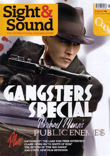 The actor on the front of the page is in character and posed. It has a large title placed in just below the middle of the page. It is in large bold lettering which establishes that it is fairly important to the selling point of the magazine as it is clear the producers want the audience to see it because of its size and colour. From examining the front covers of ‘Sight and Sound’ it has become evident that they use a wide and diverse range of fonts. This specific issue provides evidence of serif and son serif fonts. A reason for this could be because essentially when compared to ‘Empire’ backgrounds they have very little going on and a variety of fonts makes the front cover more aesthetically pleasing with regards to the use of mise-en-scene. Additionally another code and convention which occurs on a wide range of editions is the use of the sub heading ‘plus’ to instigate a list of features. This is one way in which they are able to keep the number of separate sub headings at a minimum.
The next edition is one which I took most inspiration from was (July 2009 Inglorious bastard) edition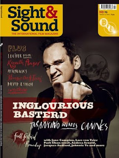 . The actor on this edition is in character and I posed looking directly at the camera. As mentioned as above in the research into ‘Empire’ taking Althussers theory of interpellation into account this is an attribute of it would appear most magazines as it gives the effect that the character is calling out to you personally. In essence this makes the audience want to go out and buy the magazine. This is just one way in which magazine producers incorporate to ensure that they make a profit. For a ‘Sight and Sound’ cover this edition uses a large amount of sub headings. However most of which are in a thin font which doesn’t really stand out and grab the reader’s attention. The reason for this being that they are important features which is evident through where they are placed with regards to the rule of thirds but that the name of the film ‘Inglorious Bastard’ is the hook in order to obtain the audiences interest. One thing in which I intend to use on my magazine front cover is the colour scheme featured on both of the above. The reason for this being that the colours used within these publications matches those of the codes and conventions for a horror film. Additionally each of the above covers appears to have representations of blood used as part of the mise-en-scene, in addition to the background and main photograph.
The final magazine cover in which I examined as a case study for the magazine ‘Sight and Sound’ is the (April 2009 cinematography special) edition.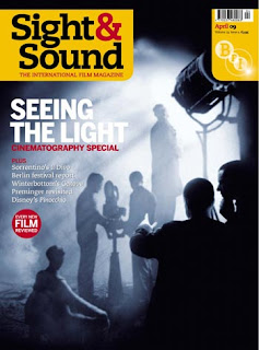 It would have appeared that from the two above editions of ‘Sight and Sound’ that I have chosen to research use mainly mid close up shots. Containing only one persona at a time. However this edition features a number of figures on the front page. It to like the (August 2009 gangster special) edition uses a limited amount of captions or sub titles. One reason for this may be due to the fact that there is a number of things happening within the photograph which is doubling as a background. On the other hand one thing in which I did note with regards to sub titles was the fact that they used people’s names to inform the reader. This suggests to me that ‘Sight and Sound’ have an avid audience who read as part of a routine. This fits nicely with what Foucault says about the narrative of the self and that consumerism of a certain media becomes almost a ritual. As a case study although it does not follow the codes and conventions for the shot size it does however confirm a number of other established codes and conventions. Something which I would further like to mention about the title of brand name of the magazine is the fact that it is in comparison to the other text it very much dominates the cover. Moreover another thing in which strikes me to be either a code or convention for the magazine ‘Sight and Sound’ is the fact that on every edition the sub headings are continuously on the left of the cover. This gives me an insight into the psychographic of the target audience. The text consistently being placed on the left hand side of the page indicates the importance of the text. Which pragmatically signifies that the magazine producer expects the target audience to read what is included within the magazine before they buy it.
Empire
Empire magazine is produced by Bauer Consumer media and is Britain’s most popular film magazine. They tend to stick to main stream films which have generated the most media hype at the time. They focus mainly on the entertainment factors. Codes and conventions in general which occur over and over again on almost all issues of ‘Empire’ which I have noted are the fact that the title of the magazine is always in the same style of font regardless and almost always in the colour red. All fonts included on ‘Empire’ front covers are son serif fonts. The reason for this being that Bauer Consumer media have built themselves a respected brand which is recognised for its title. It has also been distinguished that the title is always placed at the top reading form left to right which is a common occurrence on many magazine covers produced for a western culture. Furthermore it is strategically placed there with regards to the rule of thirds and the power structures on the page. Additionally the magazine covers normally feature the main character of the film in a posed position placed on an active background background. This normally holds ties with the films genre. It is the film in which the character is featured in which sets the theme of the cover. This is normally based around the preconceived codes and conventions of genre. Additionally there are never more than 3 actors featured on the magazine cover at one time and traditionally it would appear that no props are used. Most of the time above the name of the magazine ‘Empire’ there is a statement made which links into the brand to make a sentence. For instance ‘Wolverine has returned for…EMPIRE’. One reason for this may be to create a sense of exclusiveness to ‘Empire’ as a magazine. Making the audience think that they have to buy it as they won’t be able to find anything like it in other competitor production.
My research into ‘Empire’ magazine has lead me to examine three different editions the first one being (January 2009 wolverine) one thing that strikes me instantly is the fact that the main character within the film is placed so he is overlapping the title. When considering other issues if this happens then the character is only ever entirely placed over the letter P of the title over letters may be covered but only slightly. Essentially the reason for this is the fact that even with the letter ‘P’
 covered it is still possible to identify what magazine it is. The photo taken of the character is that of a mid long shot as you can see all but the bottom half of his legs. The reason for this being that the previous story line was that he was a mutant developed from human form. This picture demonstrates through mise-en-scene that he looks very similar to that of a human form. Another characteristic which strikes me is the fact that each cover features an actor from which ever film they are trying to exhibit in character in a posed position looking directly at the camera. Taking Althussers theory of interpellation into account this is an attribute of all ‘Empire’ magazines with regards to it calling out to its audience who subsequently go and buy it. This is the chief aim of the magazine producer. The sub head lines on the exemplar material are positioned both on the left and the right of the character. With the most important part of the information in a larger font and then almost a follow up summary beneath. However the titles positioned on the right hand side of the character are that of a smaller font which suggests there lesser importance as well as there position on the page with regards to the rule of thirds.
 The next cover in which I studied was (September 2008 watchmen)
 which confirms many of my previously assumed codes and conventions of the ‘Empire’ magazine. Although there are a few notable differences such as this cover features the maximum amount of 3 characters on the page. Throughout my research I have come across no editions with more than 3 characters featured. In comparison to the (January 2009 wolverine) edition it has very few sub headlines. The reason for this is because with 3 characters on the page there is already a lot going on. The main sub title used relates directly to the film visually advertised. Whereas the (January 2009 wolverine) edition has many captions not all of which are directly related to the film being advertised. The (September 2008 watchmen) again confirms the use of long mid shots as a convention of ‘Empire’ however I feel reason for this varies with regards to the previous example. I believe that the reason in which a mid to long shot has been used for this photo is to portray the characters power relationships with each other. As fundamentally with regards to the rule of thirds when applied to a magazine it would appear that the female character holds a large degree of power due to her position on the left of the page. However the centre and right positioned characters have the majority of their torsos showing which is an indication of their power as the left hand character is stood in a side position and you can see very little of her in comparison. Furthermore the centre character would appear to hold the most power as he is dominating the picture.
 The last edition of ‘Empire’ in which I examined was the (January 2007 Spiderman)
 which once more did confirm many of the codes and conventions of ‘Empire’. Although the other hand this edition does not include a statement above the name of the magazine. However there is a statement below the name of the magazine. This still effectively gives the audience a sense of exclusiveness to ‘Empire’. Furthermore the photo taken is that of a mid shot rather than a long mid shot. The reason in which I feel this is done is to make the gaze of the actor more intense. With a mid shot it is easier for audiences to read the emotion portrayed on the face. In alikeness with The (September 2008 watchmen) edition the (January 2007 Spiderman) edition has very few subheadings. The reason I feel this is because the photo of the character is placed with regards to the rule of thirds in the most powerful position as it is believed that is where the eye is drawn to first. Therefore Empire is enhancing its importance by not surrounding it with other important information. Finally another convention of ‘Empire’ is that all the information about which number issue it is and the price is constantly placed between the dip in the ‘M’ in the brand title. This then allows for avid readers to know consistently where they will be able to find the said information about the issue.
 Sight and Sound
‘Sight and Sound’ is a film magazine produced by the British Film Institute who role within the business is to provide features on all films on a wide scope. They tend to stick to social realist films and those not produced by Hollywood as they are largely covered by the mainstream magazines such as ‘Empire’ the reason for this being that they are obliged to do so as they are publicly funded. It not only reviews films but reports news from the film industry. Some of the subjects raised by social realist films are controversial and this therefore says a lot about the type of person in which they are attempting to target as there audience.
Obvious codes and conventions of ‘Sight and Sound’ include the fact that the title or brand of the magazine is always in black and red contained in a yellow box. The reason for this being that the British Film Institute have built themselves a respected brand which is recognised for its title. Additionally it is noted that the title is always in the top left of the magazine. With regards to western society this is what can be expected of many publication produced for western culture as this is the way in which western society reads. Again like its competitor product ‘Empire’ the title is strategically placed when considering the power structures on the page. With ‘Sight and Sound’ magazines this process is extremely evident as their title fits into the top left third of the magazine. The evidence of this is the fact that their title does not start at the very top of the page there is on all addition a border between the title and the top of the page. Also on all ‘Sight and Sound’ magazines since they underwent a new image have the bar code in the top right hand corner. Attached to this is the BFI (British Film Institute) logo. When compared to certain issues of ‘Empire’ it would appear that ‘Sight and Sound’ consistently have fewer sub captions and headlines surrounding its visual advertisement of the film. When further compared to ‘Empire’ and its background themes it can be said to use backgrounds with very little going on. Nevertheless the backgrounds used in editions of ‘Sight and Sound’ are textured.
My research into ‘Sight and Sound’ has lead me to look at 3 issues of the magazine the first being (August 2009 gangster special) edition.
 The actor on the front of the page is in character and posed. It has a large title placed in just below the middle of the page. It is in large bold lettering which establishes that it is fairly important to the selling point of the magazine as it is clear the producers want the audience to see it because of its size and colour. From examining the front covers of ‘Sight and Sound’ it has become evident that they use a wide and diverse range of fonts. This specific issue provides evidence of serif and son serif fonts. A reason for this could be because essentially when compared to ‘Empire’ backgrounds they have very little going on and a variety of fonts makes the front cover more aesthetically pleasing with regards to the use of mise-en-scene. Additionally another code and convention which occurs on a wide range of editions is the use of the sub heading ‘plus’ to instigate a list of features. This is one way in which they are able to keep the number of separate sub headings at a minimum.
 The next edition is one which I took most inspiration from was (July 2009 Inglorious bastard) edition
 . The actor on this edition is in character and I posed looking directly at the camera. As mentioned as above in the research into ‘Empire’ taking Althussers theory of interpellation into account this is an attribute of it would appear most magazines as it gives the effect that the character is calling out to you personally. In essence this makes the audience want to go out and buy the magazine. This is just one way in which magazine producers incorporate to ensure that they make a profit. For a ‘Sight and Sound’ cover this edition uses a large amount of sub headings. However most of which are in a thin font which doesn’t really stand out and grab the reader’s attention. The reason for this being that they are important features which is evident through where they are placed with regards to the rule of thirds but that the name of the film ‘Inglorious Bastard’ is the hook in order to obtain the audiences interest. One thing in which I intend to use on my magazine front cover is the colour scheme featured on both of the above. The reason for this being that the colours used within these publications matches those of the codes and conventions for a horror film. Additionally each of the above covers appears to have representations of blood used as part of the mise-en-scene, in addition to the background and main photograph.
 The final magazine cover in which I examined as a case study for the magazine ‘Sight and Sound’ is the (April 2009 cinematography special) edition.
 It would have appeared that from the two above editions of ‘Sight and Sound’ that I have chosen to research use mainly mid close up shots. Containing only one persona at a time. However this edition features a number of figures on the front page. It to like the (August 2009 gangster special) edition uses a limited amount of captions or sub titles. One reason for this may be due to the fact that there is a number of things happening within the photograph which is doubling as a background. On the other hand one thing in which I did note with regards to sub titles was the fact that they used people’s names to inform the reader. This suggests to me that ‘Sight and Sound’ have an avid audience who read as part of a routine. This fits nicely with what Foucault says about the narrative of the self and that consumerism of a certain media becomes almost a ritual. As a case study although it does not follow the codes and conventions for the shot size it does however confirm a number of other established codes and conventions. Something which I would further like to mention about the title of brand name of the magazine is the fact that it is in comparison to the other text it very much dominates the cover. Moreover another thing in which strikes me to be either a code or convention for the magazine ‘Sight and Sound’ is the fact that on every edition the sub headings are continuously on the left of the cover. This gives me an insight into the psychographic of the target audience. The text consistently being placed on the left hand side of the page indicates the importance of the text. Which pragmatically signifies that the magazine producer expects the target audience to read what is included within the magazine before they buy it.
Saturday, 27 March 2010
Progress Report- Sound Studio
 Although we did have some problems with our original trailer as group we decided that we still needed to get on with our other group task, which was to develop a radio advertisement. Using our initiative once our preproduction for the radio advertisement was well underway we booked the sound studio. We booked the sound studio for a long period of time because we intended to record our voiceover script for our trailer; our vocals for the radio advertisement; the sound effects as well as our own individually developed sound track. All of the above was achieved and we had time to spare so we began to edit our radio advertisement. This demonstrates an efficient use of time and I feel that as a group this is one of our strengths.
 As a group we had only used the audio suite once in a volunteer activity during the summer holidays. This meant that our lecturer did initially go through with us how to use the recording equipment. When left to our own devices we had our voiceover for our trailer recorded in no time at all. This was including us taking many recordings of the same spoken lines in order so we could have a variety to choose from to obtain the desired effect.

We next moved on to the recording of the radio script. This again went really well and we were able to record the script a number of times again to enable us to select the best takes. We did the scripted vocal stuff first so not to keep our vocalist waiting. As a group we did make a small mistake in the sense that we did not record the certification of our movie. However this was not such a problem as it was noted by me that when the certification is quoted it is normally said by somebody other than the main vocals. I was able to step in here and fill in. This was the only problem in which we faced and I still fell that it went well.
My role within the voiceover and radio advert production was to aid our vocalist by providing him with scripts. Whilst in there I directed the vocalist in the way in which we wished things to be spoken.
After the vocal work was all finished and we were happy with it we began to record sound effects such as heavy breathing, footsteps and the sound of the keys. Here we were able to experiment with the sounds which were being produced for example with the heavy breathing we need to increase the level of the microphone in order for it to be detected. All of the sound effects took a couple of times to achieve but this was to be expected as we were experimenting for the best result.
Following this we then proceeded to record our own individual sound track for our trailer and the radio advert. We were able to produce our own music because a member of the group is an avid musician who had some keen ideas for the dramatic music. We recorded three different pieces of music so that we have other options but as a group we did settle on one specific one in which we feel would be most suitable. This music will be featured both on the trailer and radio advert.

As we had accomplished our aims for the session and we had a great deal of time left we decided that it would be a good idea if we began editing our radio advert. This turned out to be beneficial as once we got going we became exceptionally efficient with the controls in the audio suite and were able to complete a rough edit for our radio advertisement.
I feel that this session was very successful because we managed to complete everything we wanted and more within the designated time slot. This I feel boosted the confidence of the group slightly as it felt like we had accomplished something.
Friday, 26 March 2010
Location Photos

This photo is of the stair case in which two of our shots will be filmed for our trailer. The first shot featured here will be the one where the chair is thrown down the stairs. The second scene that we wish to film in this location is from under the stair case of someone walking sinisterly down the stairs. The reason which I feel this particular staircase is appropriate is because it is the staircase leading to the staff offices and they are less frequently used by large amounts of people in comparison to other staircases within the college. Furthermore there is an electrical socket which we could use if the batteries run out on the camera.

The next location photo is of a classroom in which we intend to film our protagonists working on some college work before one of them gets attacked and they discover that they have been locked in. The reason in which I feel this location will be appropriate is because it looks like a typical classroom because of the layout of the tables and chairs. Also it has many electrical sockets just encase we require to run the camera off of the mains circuit.

The next location still is a photo of a deserted college corridor in which we intend to film at least three scenes in. one of those will be the dramatic scene where one of our protagonists is seen being grabbed by someone into cupboard. Another scene will simply be a shot of the entire protagonist running quickly. The final scene in which we intend to shot is another dramatic one whereby the antagonist is running the blade of the knife along the wall. The reason ion which I feel this corridor is appropriate for the location of this scene is because it is a corridor which I not very often used by students. Additionally the natural light that lights the corridor is dim because of the trees growing outside the window.

This photo is of the door in which we intend to shot the scenes where the antagonist is seen locking the door and where the protagonists discover that they are locked in. The reason in which we have chosen this door is because firstly it has a lock. Another reason why this location is appropriate is because there is a light switch on the other side of the door which grants us control over the light levels.
SWOT for Magazine Cover
This is my SWOT analysis for my magazine cover part of my individual coursework task. Here i will evaluate my strengths, weaknesses, opportunities and threats.
Strengths
* I am efficent at organising myself and my work
* I am efficient at time management
* I am motivated
Weaknesses
*Limited knowlegede of the software
*Only basic skills when using the software
* Not a magazine reader myself
*Never produced a professional magazine cover
Opportunities
* My lecturer has provided workshops which provided me with my basic skills
* There is plenty of case study material to refer to
* My lecturer is available to me via email to answer any questions
* The software within college is of high standard and good quality
* Software in college is available on a number of computers
Threats
* My lack of knowlegde and skills may mean that my product does not look professional
* My lack of knowlegde and skill may mean that my product takes more time to produce than i have planned for
* My other subjects need just as much attension as my media coursework
Progress Report- Radio
Although with our trailer we were facing a few difficulties as a group we were still able to proceed with the preproduction material for producing a radio advert. This is evidence of our team efforts and dedication to the coursework as we still needed to work on our trailer at the same time.
To start our initial ideas for the radio we established a few codes and conventions from films within our chosen genre horror in which we could apply to the radio. For instance the use of silence or dramatic music in order to build suspense and tension. We then as a group thought about the sort of information in which we wished our radio advert to inform our audience about. Things in which were taken into consideration included a website address and the release date. We then developed a script in which would be appropriate to notify the audience of the information. Information such as the release date and the web address was strategically placed towards the end of the advert so that they are the last things in which the audience hears. This therefore means that they are more likely to remember it.
As a group we researched the rules in which govern the production of radio adverts and established some of the most important ones. For example our radio advert must not include any sudden loud noise so not to cause accidents for users. We then took these rules and used them to guide our ideas about the sort of sounds in which we should include. It was hear in which we decided to use the sound of keys as our signifying element to the rest of our media products. Furthermore because we felt that in order to maintain our audience’s interest we should include some background music which appropriately helped to build tension as well.
One important code and convention of radio is the fact that they are normally between 30 seconds and 45 seconds long as they need to be built to fit a radio schedule which has specific slots. Our intention is to have our radio advert 30 seconds long as it is just long enough to include all the information and short enough so that the listener doesn’t get bored.
Analysis of Filming of The Trailer #2
As a group we managed to complete all the necessary preproduction in which we would need in order for us to film this included new story boards, voiceover scripts and all the permission documentation. 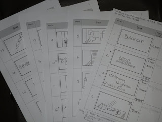
The filming of our new sequence of scenes took nearly 3 hours in total. This included all production members taking production stills and photos for the portfolio. Once we had begun filming things seemed to run smoothly and go well. We managed to obtain all the extra shots in which we needed for the trailer. Like before I assumed the role of director as I was the one who designed the story boards with help from the other team members.
On the day of filming something in which did cause some concern was the fact that one group member had an alternative idea as to the way in which we would film certain shots. The reason I feel this was is due to the diminutive amount of time in which we had in order to produce the pre production. Meaning there was less time for debates and queries. This problem was overcome by referring to the story boards and I believe that they are happy with the overall effect of the shots.
Additionally for one of our scenes in which we filmed it was required that a chair was pushed down a flight of stairs in order to add some action and chaos to our trailer. This was a fairly noisy process and although we did inform the staff in their office that that this is what we were doing a member of staff did become concerned as they had not been informed of our activity and consequently asked us to stop. This would have been problematic if we hadn’t informed other teachers as it is likely they too would have wanted us to stop but because we had we were able to obtain the shots we needed first before somebody became concerned. After the filming the same member of staff did approach sympathetically and enquire that we had the shots we needed.
Even though the actual filming of the trailer went well during the editing of the footage our editor noticed that our new footage was shot in 4x3 and our original footage was in wide screen. This was an error on our behalf as we did not think to check the settings of the camera. Although in our defence the scenes shot in wide screen were not deliberate and we did not choose for this to happen. Although essentially this seemed problematic we have been able to rectify the problem during the editing process.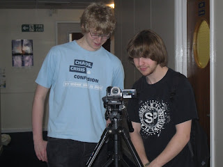
I feel that the completion of the filming process for our trailer has boosted the moral of the group and we are now almost back on track with regards to being finished on time. Any problems that occurred on the day of filming were dealt with in a professional manner and the whole experience is proof of good organisation and team work as we have been able to alter our schedule and still keep up the work load through the added efforts of the group.

The filming of our new sequence of scenes took nearly 3 hours in total. This included all production members taking production stills and photos for the portfolio. Once we had begun filming things seemed to run smoothly and go well. We managed to obtain all the extra shots in which we needed for the trailer. Like before I assumed the role of director as I was the one who designed the story boards with help from the other team members.
On the day of filming something in which did cause some concern was the fact that one group member had an alternative idea as to the way in which we would film certain shots. The reason I feel this was is due to the diminutive amount of time in which we had in order to produce the pre production. Meaning there was less time for debates and queries. This problem was overcome by referring to the story boards and I believe that they are happy with the overall effect of the shots.

Additionally for one of our scenes in which we filmed it was required that a chair was pushed down a flight of stairs in order to add some action and chaos to our trailer. This was a fairly noisy process and although we did inform the staff in their office that that this is what we were doing a member of staff did become concerned as they had not been informed of our activity and consequently asked us to stop. This would have been problematic if we hadn’t informed other teachers as it is likely they too would have wanted us to stop but because we had we were able to obtain the shots we needed first before somebody became concerned. After the filming the same member of staff did approach sympathetically and enquire that we had the shots we needed.
Even though the actual filming of the trailer went well during the editing of the footage our editor noticed that our new footage was shot in 4x3 and our original footage was in wide screen. This was an error on our behalf as we did not think to check the settings of the camera. Although in our defence the scenes shot in wide screen were not deliberate and we did not choose for this to happen. Although essentially this seemed problematic we have been able to rectify the problem during the editing process.

I feel that the completion of the filming process for our trailer has boosted the moral of the group and we are now almost back on track with regards to being finished on time. Any problems that occurred on the day of filming were dealt with in a professional manner and the whole experience is proof of good organisation and team work as we have been able to alter our schedule and still keep up the work load through the added efforts of the group.
Thursday, 25 March 2010
Revision of the Trailer Idea
After filming our initial trailer we then proceeded to begin editing. It was at this stage which we noticed that our selection of shots did not give the effect we were looking for. This became problematic because our chosen genre was horror and essentially from viewing our paper edit it looked more like a comedy or a spoof. This was not the effect in which we were aiming for. As a group we decided that the reason for this was because in some of our scenes the actors didn’t really appear to be in character. Although we did ask them not to smile as a member of the production team we couldn’t physically stop them form doing so. As we were filming in their own free time and they were doing the acting as a favour. Furthermore none of our chosen actors were professional. However the failure of our first trailer can not be blamed entirely on the actors. As a group I feel we paid to much attention to the slow build up of enigma and this resulted in us missing out the action scenes which are designed to make the audience jump. We intend to address this problem by rescheduling a day for filming, where we will primarily address incorporating action shots which within itself should help to build more enigma. Additionally we decided to include a visual representation of a weapon again this is to help build the enigma. With all of this taken into consideration it should address our previous problems.
Nevertheless although the filming of the film had not gone as well as I had first thought it was not an entire waste of time. As much of the footage shot initially can be used in the final trailer as it is the way in which we have attempted to build tension and enigma.
The plan now is to reorganise the storyboards to incorporate some of our new ideas. This will also result in changes to the voiceover story board and script. The new ideas in theory should not affect the script as there are very few spoken lines as our intension is to use dramatic music produced by a group member and recorded by the group to help build the tension and enigma within our trailer.
All in all i feel the experience has been a learning curve for the group and that as a group now it has made us more aware of the fact that all the codes and conventions used within either trailers or films all play an important part in the representation and into how the audience perceive a media text.
Wednesday, 17 March 2010
Analysis Of The Filming Of The Trailer
The date in which we had decided to film approached and with most of our preproduction completed the filming went ahead as scheduled. This was possible because we had made sure that anything that was needed for the production of the trailer was completed fully before the date of filming. This provides evidence of good organisation and time management skills on behalf of the group. Having everything we required for the trailer finished before the date of filming allowed for us to revisit tasks and make any amendments in which we felt necessary. The actual filming of the trailer took no more than 3 hours. This included all production members taking production stills and photos for the portfolio. The reason in which I feel things went so well is all down to thorough planning, good organisation and time management skills. Items such as detailed story boards and scripts enabled us to produce our trailer swiftly and efficiently.
My role within the production of the trailer was to act as director and take primary responsibility for coordinating the work of all of the team members. As well as referring to the script and story board to make sure that they were being followed as closely as possible. The reason in which I assumed this role was because I was the team member who developed everyone’s ideas into one compatible one this being the role of the screen writes.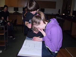
If I had to suggest a problem which caused the most issues it would have been location. As although we had taken test photographs to make sure that it were suitable for our needs we did encounter some minor problems. Firstly and possible the most threatening was the fact that the stairs in which we had decided to use as one of our locations had a bike padlocked to the railings. We then faced the dilemma of finding the owner of the bike and asking whether it would be possible for them to move it temporarily. The reason in which this caused such a problem for our production was the fact that we were attempting to create a sense of isolation and abandonment within our trailer. Furthermore the stairs in which we intended to use were the only appropriate location within the college. Our first port of call was the staff room in which we were able to contract the person whose bike it was through a lecturer. In the end this situation did not pose a serious threat however it did put us behind schedule. Nevertheless this time was made up as our producer became more confident and accurate when using the equipment.
Additionally with regards to location we faced another crisis as unfortunately one of the doors that we had intended to use produced too much reflection. Something which could have been avoided if it was noticed when producing our test shots for our trailer of the locations. The only way around this would have been to have taken the test shots of the location at the same time of day in which we planned to film at. Although other members of the group found this occurrence quite disheartening and stressful for me I was less concerned. As essentially there are many doors within college in which we could have used. Which is what occurred in the end and I feel the end product of that scene is just as effective.
Something else which posed a threat to our production was that one of the cast or actors did not turn up as arranged and we had to find somebody to replace them a short notice. Although inconvenient this did not pose to large a threat to the production schedule as we were able to call upon peers who were willing to help. As a result of this the production of the trailer commenced on time. However even if the filming did not start on time this would not have been a problem as we had booked the equipment and location for longer than would have been necessary as we had taken the unexpected into account.
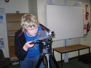
Finally the last problem in which we encountered was a sudden dramatic loss of battery life although the batteries had been fully charged at the beginning. Although potentially if we were unprepared this could have caused a serious threat to our production but thankfully the batteries didn’t run out. Also because we were so well organised there was a back up battery as well as the opportunity to run the camera off of mains electricity through sockets at all of our locations. Fundamentally this never really caused our production any threat. The reason for this being that as soon as this problem was noticed we began running the camera off of the colleges mains electricity to make sure that when filming we did not lose any footage.
On the day of the filming of the trailer each group member took the initiative to bring in their own personal stills camera in order for them to take production stills and photos in which they may choose to use on either their individual magazine covers or website pages. This not only shows initiative it provides evidence for the fact we as a group are forward thinking. As by using the same day to take production stills it has increased the continuity for our campaign through the use of dress codes as a signifier. This will be reflected in both the magazine cover and web page.
In conclusion on the day of filming everything went according to plan and we only faced minor difficulties on the day of the production. We managed to accomplish all the scenes in which we required. Filming each scene at least 3 times to make sure we have a variety of shots to choose from. This essentially should make the process of editing easier. Any problems that we may have encountered were dealt with in a professional way and with all members of the group equally doing there best to produce a top quality trailer.
My role within the production of the trailer was to act as director and take primary responsibility for coordinating the work of all of the team members. As well as referring to the script and story board to make sure that they were being followed as closely as possible. The reason in which I assumed this role was because I was the team member who developed everyone’s ideas into one compatible one this being the role of the screen writes.

If I had to suggest a problem which caused the most issues it would have been location. As although we had taken test photographs to make sure that it were suitable for our needs we did encounter some minor problems. Firstly and possible the most threatening was the fact that the stairs in which we had decided to use as one of our locations had a bike padlocked to the railings. We then faced the dilemma of finding the owner of the bike and asking whether it would be possible for them to move it temporarily. The reason in which this caused such a problem for our production was the fact that we were attempting to create a sense of isolation and abandonment within our trailer. Furthermore the stairs in which we intended to use were the only appropriate location within the college. Our first port of call was the staff room in which we were able to contract the person whose bike it was through a lecturer. In the end this situation did not pose a serious threat however it did put us behind schedule. Nevertheless this time was made up as our producer became more confident and accurate when using the equipment.
Additionally with regards to location we faced another crisis as unfortunately one of the doors that we had intended to use produced too much reflection. Something which could have been avoided if it was noticed when producing our test shots for our trailer of the locations. The only way around this would have been to have taken the test shots of the location at the same time of day in which we planned to film at. Although other members of the group found this occurrence quite disheartening and stressful for me I was less concerned. As essentially there are many doors within college in which we could have used. Which is what occurred in the end and I feel the end product of that scene is just as effective.
Something else which posed a threat to our production was that one of the cast or actors did not turn up as arranged and we had to find somebody to replace them a short notice. Although inconvenient this did not pose to large a threat to the production schedule as we were able to call upon peers who were willing to help. As a result of this the production of the trailer commenced on time. However even if the filming did not start on time this would not have been a problem as we had booked the equipment and location for longer than would have been necessary as we had taken the unexpected into account.

Finally the last problem in which we encountered was a sudden dramatic loss of battery life although the batteries had been fully charged at the beginning. Although potentially if we were unprepared this could have caused a serious threat to our production but thankfully the batteries didn’t run out. Also because we were so well organised there was a back up battery as well as the opportunity to run the camera off of mains electricity through sockets at all of our locations. Fundamentally this never really caused our production any threat. The reason for this being that as soon as this problem was noticed we began running the camera off of the colleges mains electricity to make sure that when filming we did not lose any footage.
On the day of the filming of the trailer each group member took the initiative to bring in their own personal stills camera in order for them to take production stills and photos in which they may choose to use on either their individual magazine covers or website pages. This not only shows initiative it provides evidence for the fact we as a group are forward thinking. As by using the same day to take production stills it has increased the continuity for our campaign through the use of dress codes as a signifier. This will be reflected in both the magazine cover and web page.
In conclusion on the day of filming everything went according to plan and we only faced minor difficulties on the day of the production. We managed to accomplish all the scenes in which we required. Filming each scene at least 3 times to make sure we have a variety of shots to choose from. This essentially should make the process of editing easier. Any problems that we may have encountered were dealt with in a professional way and with all members of the group equally doing there best to produce a top quality trailer.
Wednesday, 10 March 2010
Progress Report: Pre-production Material
For the past couple of weeks the main focus for my group has been the preproduction stages of our coursework. As a group I feel that we have managed our time effectively and efficiently which has resulted in a successful completion of the filming for our trailer. At the moment all tasks are up to date and we are on scheduled to be finished on time.
As my majority role within the pre production is the screen write my consideration as to the most difficult aspect of the planning I would have to say that it was developing the story board in order to make it look like a trailer and less like the opening of a film. However through much deliberation and discussion as a group we were able to come together and discuss the different codes and conventions and how we as individuals had interpreted them. This quickly resolved such issues as where to put opening credits and film title. Fundamentally the difficulties faced with the story boards have been worth it as I have been able to produce detailed story boards. This has enabled the entire group to have a clear picture in their heads about what we are aiming to produce.
Additionally taking into consideration all of the rules and regulations for our trailer has also been fairly difficult. For instance there is legislation in place which states that within a trailer you may not represent a minority group in a derogative way including the use of stereotypes. For me both the representations of a minority group and a stereotypical view are all down to personal opinion. Needless to say I overcome this by researching further into our target audience and I have decided the way in which we can overcome such an obstacle is by firstly not being derogative in our trailer and secondly by not using stereotypes in order to shock our audience. Essentially within all productions there must be a degree of stereotypical values within them otherwise the audience would not understand what was being represented to them.
On the other hand I feel although there have been a few difficulties with regards to the pre-production as a group we have accomplished a lot. One thing in which we have done well is developing signifiers that will connect all 4 media productions to our campaign. Moreover another thing in which we have achieved is a good strong recognition for the key codes and conventions for our trailer mainly but this has then gone on to inform our radio advertisement and our own individual media pieces. This was done through identifying a genre for our products all to follow. This too then influenced and informed our signifiers throughout our campaign.
Finally honestly I would have to say although I feel that we are well organised and on schedule yes it is a shock to realise that the submission date is so close. As there is so much we as a group wish to do with our products in order to make them successful.
Audience Analysis For Viral Campaign Products
When producing a media text it is important to establish who your target audience are. It is common knowledge that most producers will have constructed a fully psychographic and demographic profile of a person who they will be directly constructing their media product for. Although this person is essentially fictitious it is likely that there is someone amongst the audience who fits this profile.However such people will only account for the minority of audience members. Fundamentally it is impossible to interest all members of the public to your product. As a result of this it would be fair to say that as a media producer you do rely on your experience with existing audiences from the real world in order to target your own on a wide basis. For example as a media producer on a wider basis you would be looking to attract an audience through some of either their psychographic or demographic factors. As our task is to produce a viral campaign I feel we are able to influence a vast amount of people as each different form of media is accompanied by their own target audiences. As a group we have had to explore all the different codes and conventions for all the different media forms in which we intend to produce.All in all I feel that when constructing an audience for a media text it is in effect a mixture of both a fictitious thing as well as drawing on experiences. Furthermore it must be mentioned that essentially an audience make a film and must be pre existing otherwise media producers wouldn’t know who or how to target the audience.
The magazine cover and web page which I have produced as part of a viral campaign to advertise the film ‘Locked Away’, essentially all share the same target audience as that of the film. Therefore it has been important to follow the set codes and conventions of the films genre and continue them onto the other products in order for the audience to identify what is being represented to them.
The genre of our film is horror and it is here in which as a media producer you apply codes and conventions in order to attract your audience. A typical convention of horror films is to have them age restricted. This then means that because our film is a certificate 15 that our audience members will all be in their late teens and still in an educational environment. The photograph I’ve used depicts three young people sat on a staircase to induce the idea of students. The reason for this being that our location for the film is set in a college and to fully appreciate what is being represented in the film suggests that our target audience will still be in education. Additionally another mise-en-scene convention for the genre horror is the use of dark and red colours. I have continued this convention onto my magazine cover as essentially I will be using it to promote the films genre.
The demographic features of my target audience are as follows:
· Age: 15-20years
· Location: Britain
· Career: Student
· Nationality: British
· Ethnicity: white
Many of the codes and conventions used within all of my viral campaigns products have specific connotations for my target audience. As they themselves can identify with what is being represented as they recognise themselves in the products. This fits with Foucault’s theory of the narrative of the self. People see themselves in a media product and then consume it as part of a routine to become more and more like it. On the other hand Anne Cronin’s theory of if you buy it you can become it can also be applied as she would suggest that audiences buy media products in order to become more like what is being represented.
Monday, 8 March 2010
How is your contextual understanding of the media developing?
For our A2 media studies advanced portfolio we are required to produce an advertising campaign for our production. This is to include a trailer, radio advert, web page and the front cover of a magazine featuring our production. There is a vast range of different media forms and this has developed my contextual understanding of the media in a number of ways.
One way in which the advanced portfolio has developed my contextual understanding is by allowing me to look at more than just the visual media. For instance during the foundation portfolio we were only required to distinguish the codes and conventions for genres within films. Whereas with the advanced portfolio it is necessary for us to look at radio as well as the visual forms of media such as print and film. To add to this it should also be mentioned that because the advanced portfolio is a viral campaign there needs to be a theme in which all the products follow in order for the audience to establish an association with the product. This has developed my contextual understanding of the media in the sense that we needed to look at viral campaigns and find common associations within their products.
Through such research of other viral campaigns it was decided by the group that the common theme within our campaign would be the sound of keys or a visual representation of keys. The reason for this being that a set of keys seemed to be the logical theme in the sense that our film title is ‘locked away’ and our storyline is that a group of students find themselves locked in at college. Our aim is to create an association with a set of keys to our campaign.
Another way in which my contextual understanding of the media has developed is through the research into target audiences. The advanced portfolio has required me to further deeper my understanding of audiences as well as explore new audiences for example radio audiences have considerable differences to those of a trailer audience. Such differences all stems down to the fact that with a radio advert there can be no visual representation. Along side this with, radio adverts such issues as human psychology needs to be taken into consideration. For example it has been said that anything at the beginning of a radio advert is mostly forgotten by its audience. Therefore it is essential as media producers that we make sure all the information we want the audience to remember is strategically placed.
Furthermore my understanding of contextual media has developed as all the different media forms each have their own codes and conventions. Which in order to produce a successful campaign it has been important for me to interpret correctly. I have been able to note that with visual media’s such as print and web that those codes and conventions rely strongly on mise-on-scene to establish the genre. Whereas with such media forms as radio it is more difficult and all of it must be done through the use of sound.
Another key way in which my contextual understanding of the media has developed is through the research into the rules and regulations with regards to producing each of the forms of media. For example when producing an advert for the radio sudden loud noises are prohibited as radios can be found in most cars and sudden noise might distract the driver. Additionally on the visual forms of media it is important that nudity is kept to a minimum and is appropriate.
Monday, 1 March 2010
Devising Teaser Trailer Idea
The first thing in which we did as a group was to discuss which genre we could like to produce a trailer for. It was agreed upon by all that our chosen genre would be horror. The reason for this being that all members had seen a number of horror movies. Resulting in us as a group being able, to establish the codes and conventions in order to create a successful trailer. Furthermore it was felt that this was the genre in which we had most experience with and that had strong codes and conventions. Easily recognised and recreated in our own production.
As part of our summer work we were required to develop initial ideas for a teaser trailer. As a group we decide to use some of these initial ideas from group members where deemed appropriate. As well as incorporating our new idea for the teaser trailer.
From one group member it was decided that our trailer storyline would be very similar. Taking from their work the synopsis and location for the trailer. From my own we decide to take the idea that the antagonists may or may not be real. This stemmed from the mental health issue included within my initial idea. Something else in which we acquired was adopted from the other group member was the lack of diagetic dialogue from the characters, replacing it with music.
Subsequently we developed a story board which was primarily the responsibility of me as I was appointed the job role of play write. When creating the story board it was important for me to take into consideration our influence trailers in which other group members were researching and analysing.
Moreover I feel it was imperative to consult on a regular basis with my group members as they in some cases had picked up on certain codes and conventions in which I hadn’t. Effectively I feel this has improved our production story board a great deal. Additionally each member of the group is now pleased with the completed story board. The benefits of story boards are that you are able to plan the camera shots, camera movements and duration. That enables the group to get a detailed picture of what the final product should look like.
One thing in which posed a challenge to the group was the fact that it was not necessary to make a whole film and thus it does not need cohesion in order to make complete sense. As you would not expect a professional trailer to give away the entire film. However this was over come by including short scenes of the action taking place and the use of jump cuts.
After developing the story board I developed a voice over story board which matched certain scenes to the voiceover. This in the long run should help us place the correct voice over to the correct scenes. Which in turn will cut the time it takes to produce as it has already been organised. The voice over itself again takes influence from other trailers in which we researched. It was noted that firstly the majority of horror teaser trailers do contain a voice over. In addition such catch phrases as ‘coming soon to a cinema near you’ were also featured in horror teaser trailers so essentially we included it within our own trailer. This within its self can be counted a convention of horror teaser trailers.
After creating the story board I developed a script from it, fitting in appropriate dialogue to the scenes which required it. As mentioned above there was very little dialogue. As a group we decided to keep the dialogue to a minimum. As this would make the use of non diagetic music more effective. Again I constantly consulted with my group members in order to maintain their influences throughout the pre production tasks.
Subscribe to:
Comments (Atom)
