Here is the group’s finished radio advertisement for the film ‘Locked Away’. The production and editing of the radio advertisement took less time than I would have expected. The software in which we used to record and edit the radio advert was much simpler than I would have expected. As a group we had booked the sound studio for a number of hours and our objectives were to just record the sound for it. However because we completed our objectives so quickly as a group we felt that an efficient use of our time would be to continue onto the editing process. By doing this it made it easier for the group to make decisions about the audio as within the sound studios there are speakers which allow us all to hear at the same time and discuss. Overall I am very pleased with our finished product and feel that the completion of this group task boosted the morale of the group.
Tuesday, 20 April 2010

Thursday, 15 April 2010
Progress Report Pre-Production Web Page
Having now completed my research into case study material for my webpage I am now looking to develop a draft or a plan of what I would like my webpage to look like. My research has provided me with information on codes and conventions as well as the sorts of information which are included on film promoting websites. Out of all of the tasks in which I have had to complete the research into websites has been the most challenging. The reason why I feel this has been the case is due to the fact that although websites for films of the same genre use similar codes and conventions there are many different items included on each different case study that I have looked at. Especially when you compare the layouts of websites to that of magazines. For instance for each magazine brand there is a certain layout style which you should follow, but with websites there are so many different things you can do. On the positive side this allows for a large degree of creativity when developing the website.
All of the websites that I looked at included a trailer preview for the film they were advertising. I am not going to include this on my own website because I feel the focus should be more about identifying and using correctly the codes and conventions. However if I were to take my advanced portfolio further this would be something I would consider including onto my website.
From examining my case study material it became clear that many of the codes and conventions used in both the trailer and the magazine cover can be identified on the webpage’s. All of which can be directly related to the genre of the film horror. For example the use of reds and blacks and other dark colours form the majority of the colour schemes in place on my case study materials. It was at this stage that I decided the use of serif fonts would be most appropriate for the film title and other film related information with regards to the genre of the film. However I do intend to use non serif fonts for the selection of information at the bottom of my website to help differentiate the information form the advertisement text.
I have completed an ideas blast of things which I need to include on my own webpage as part of its development as well as a SWOT analysis which has highlighted threats and weaknesses which I need to try and overcome in order for my website to be successful.
All of the websites that I looked at included a trailer preview for the film they were advertising. I am not going to include this on my own website because I feel the focus should be more about identifying and using correctly the codes and conventions. However if I were to take my advanced portfolio further this would be something I would consider including onto my website.
From examining my case study material it became clear that many of the codes and conventions used in both the trailer and the magazine cover can be identified on the webpage’s. All of which can be directly related to the genre of the film horror. For example the use of reds and blacks and other dark colours form the majority of the colour schemes in place on my case study materials. It was at this stage that I decided the use of serif fonts would be most appropriate for the film title and other film related information with regards to the genre of the film. However I do intend to use non serif fonts for the selection of information at the bottom of my website to help differentiate the information form the advertisement text.
I have completed an ideas blast of things which I need to include on my own webpage as part of its development as well as a SWOT analysis which has highlighted threats and weaknesses which I need to try and overcome in order for my website to be successful.
Website Research
In order to complete my advanced portfolio it is necessary for me to design and create a web page which will be part of my viral campaign and act as a further advertisement for the film ‘Locked Away’. The websites which I will look at are the webpage’s designed for ‘A Nightmare on Elm Street’, ‘The Hills Have Eyes’ and ‘Dawn of the Dead’. All of which have formed some influence in the making of the trailer.
‘A Nightmare on Elm Street’
Firstly when examining this webpage it is evident which genre the film it is advertising belongs to. The reason for this being that it follows the mise-en-scene colour conventions of reds and dark colours which are associated with the genre horro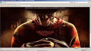 r. Also with regards to codes and conventions being indicators as to the genre of the film the same could also be said for the photograph as it is a close up of the actor in character which dominates the page. The use of close up camerawork is a common convention of horror films. To add to this you cannot see the full face of the antagonist this hides his identity which is another common convention of horror films. The link bar to things such as downloads is positioned at the top of the page in the centre. With regards to the rule of thirds it holds a fairly important position as they are either ways to make money or advertise the film which in the long run will make money. The reason for it holding such a dominant position is due to the fact that the production team’s priority is to make money. Also within the photograph the weapon is being held by the protagonist and it has a striking shine. This is something which I feel will be appropriate to use on my own personal webpage. The ‘A Nightmare on Elm Street’ website also has included on it a catch phrase which they have branded in order for the audience to associate it with the film. Through the groups use of a voice over on our trailer it would be suitable for me to take a phrase from it and use it on my website. The title of the fi
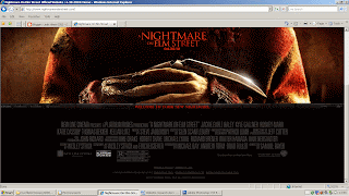 lm has been strategically placed in the centre of the page so that it is possible to see it at all times even when you scroll down. Being in the centre of the page it immediately grabs the audience’s attention and is one of the first and last things you see. This has been done because it means that the audience have more chance of remembering the title of the film. The date of the release of the film is also placed in the same general area. Additionally on the website there are links to social networking sites which are ways for the audience to meet people who share similar interests and opinions. It is also a way in which allows the audience to express a collective identity and forms a valuable tool for producers of new films of similar genres. As they are able to get ideas about demographic and psychographic factors for their own target audience. At the very bottom of the page is a selection of information such as the name of producer, editor and screen writer. The reason this is included is due to the fact that some audience members will go and see a film because of who it was produced by or acting in it because they have enjoyed their previous works. However because it is placed towards the bottom of the page suggests that it is not them whom the producers are directly targeting. This occurs on all of the websites which I have examined and would appear to be a convention of all film websites.
‘The Hills Have Eyes’
When comparing ‘The Hills Have Eyes’ webpage to the webpage for ‘A Nightmare on Elm Street’ to look at they are essentially different however many of the same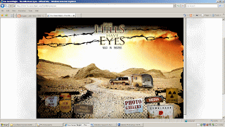 codes and conventions apply. For example the webpage still complies with the use of dark and red colours which helps the audience identify the genre of the film which it is advertising. Unlike the ‘A Nightmare On Elm Street’ webpage ‘The Hills Have Eyes’ webpage uses an illustration of the location where the film is set. One reason for this could be the fact that the film ‘The Hills Have Eyes’ holds strong pragmatics into the idea of isolation. This is another key convention of horror films. At the top of the page in the centre is the title of the film. With the illustration acting as a background the title position is very eye catching. It has had effects added to it such as an outer glow which all adds to its dominance on the page. The link bar included on ‘The Hills Have Eyes’ webpage has been integrated as part of the illustration. This draws links to the film and the website because it is a representatio
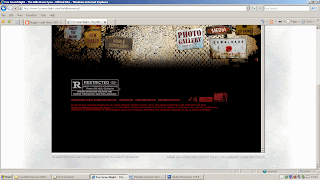 n of the location in which the film was produced. Little things like this help the audience to draw connections between the products. This is essential for a viral campaign to be effective. The title of the film is included at the top of the webpage in the centre of the page. With regards to the rule of thirds the title of the film holds a fairly dominate position. Its dominance is highlighted through the use of an outer glow around the title which makes it eye catching and attention grabbing. The reason for this is that it is something which the producers want you to remember. At the bottom of the webpage is a selection of copyright laws and regulations. It does not include the names of cast or crew like ‘A Nightmare on Elm Street’ but this information is all included in the link bar. This suggests that ‘The Hills Have Eyes’ film is trying to directly target those audience members who go and see a film for its credentials such as the director or actors starring in it.
‘Dawn of the Dead’
Again like mentioned before all three of the webpage’s in which I have studied follow the codes and conventions of the mise-en-scene with consideration to c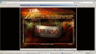 olour codes. The ‘Dawn of the Dead’ website uses black, red and various other dark colours. This instantly allows the audience to make associations to the genre of the film. The title of this film is placed in the top left hand corner of the website. Both the colour scheme and the titles font play on the film title’s word dawn. The letters in the top left hand corner are stretched and this gives the effect of a shadow. By incorporating such ideas it provides a link for the audience to the film and the rest of its products. Having the title of the film at the top with a glow around the letters makes it eye catching and attention grabbing. This supports the idea that this is what the web page designers want you to remember. On the right hand side of the page is the links bar which includes things such as ‘about the film’ and ‘photographs’ with regards to the rule of thirds they would appear to hold a weak position and your attention is more directly placed on the slogan which is positioned directly in the centre of the website. Something which has been included on this website for the film ‘Dawn of the Dead’ is above the link bar there are more links to games and other information about movies of a similar genre. This indicates that one of the psychographic factors of their target audience was an already existing interest in zombie horror films. When compared to ‘The Hills Have Eyes’ and ‘A Nightmare on Elm Street’ websites it would appear that there are no copy right laws and regulations or selected information on actors, directors and this then supports the idea that the main people who they are targeting are those already with a pre existing interest in zombie films. One thing which does strikes me about this website is that the website fits onto one screen and there is no need for a scroll bar. This makes things easier for the audience as they can see all of the information at once. Also included on this webpage is an advertisement for a spinoff of the film ‘Shaun of the Dead’. This advocates that this website has been altered since the release date of the film and therefore information may have been altered or removed.
In conclusion from my research I can see that the websites for each film all follow a set of codes and conventions all linked to the genre of the film that they are advertising. I can further see that although following many of the same codes and conventions that each individual web page is different. This has granted me with a degree of creativity with what I will do to produce my own web page. However it is from this research that I have been able to determine a colour scheme for my website and the positioning of certain information. It has also helped me by providing me with examples of information which needs to be included.
‘A Nightmare on Elm Street’
Firstly when examining this webpage it is evident which genre the film it is advertising belongs to. The reason for this being that it follows the mise-en-scene colour conventions of reds and dark colours which are associated with the genre horro
 r. Also with regards to codes and conventions being indicators as to the genre of the film the same could also be said for the photograph as it is a close up of the actor in character which dominates the page. The use of close up camerawork is a common convention of horror films. To add to this you cannot see the full face of the antagonist this hides his identity which is another common convention of horror films. The link bar to things such as downloads is positioned at the top of the page in the centre. With regards to the rule of thirds it holds a fairly important position as they are either ways to make money or advertise the film which in the long run will make money. The reason for it holding such a dominant position is due to the fact that the production team’s priority is to make money. Also within the photograph the weapon is being held by the protagonist and it has a striking shine. This is something which I feel will be appropriate to use on my own personal webpage. The ‘A Nightmare on Elm Street’ website also has included on it a catch phrase which they have branded in order for the audience to associate it with the film. Through the groups use of a voice over on our trailer it would be suitable for me to take a phrase from it and use it on my website. The title of the fi
 lm has been strategically placed in the centre of the page so that it is possible to see it at all times even when you scroll down. Being in the centre of the page it immediately grabs the audience’s attention and is one of the first and last things you see. This has been done because it means that the audience have more chance of remembering the title of the film. The date of the release of the film is also placed in the same general area. Additionally on the website there are links to social networking sites which are ways for the audience to meet people who share similar interests and opinions. It is also a way in which allows the audience to express a collective identity and forms a valuable tool for producers of new films of similar genres. As they are able to get ideas about demographic and psychographic factors for their own target audience. At the very bottom of the page is a selection of information such as the name of producer, editor and screen writer. The reason this is included is due to the fact that some audience members will go and see a film because of who it was produced by or acting in it because they have enjoyed their previous works. However because it is placed towards the bottom of the page suggests that it is not them whom the producers are directly targeting. This occurs on all of the websites which I have examined and would appear to be a convention of all film websites.
‘The Hills Have Eyes’
When comparing ‘The Hills Have Eyes’ webpage to the webpage for ‘A Nightmare on Elm Street’ to look at they are essentially different however many of the same
 codes and conventions apply. For example the webpage still complies with the use of dark and red colours which helps the audience identify the genre of the film which it is advertising. Unlike the ‘A Nightmare On Elm Street’ webpage ‘The Hills Have Eyes’ webpage uses an illustration of the location where the film is set. One reason for this could be the fact that the film ‘The Hills Have Eyes’ holds strong pragmatics into the idea of isolation. This is another key convention of horror films. At the top of the page in the centre is the title of the film. With the illustration acting as a background the title position is very eye catching. It has had effects added to it such as an outer glow which all adds to its dominance on the page. The link bar included on ‘The Hills Have Eyes’ webpage has been integrated as part of the illustration. This draws links to the film and the website because it is a representatio
 n of the location in which the film was produced. Little things like this help the audience to draw connections between the products. This is essential for a viral campaign to be effective. The title of the film is included at the top of the webpage in the centre of the page. With regards to the rule of thirds the title of the film holds a fairly dominate position. Its dominance is highlighted through the use of an outer glow around the title which makes it eye catching and attention grabbing. The reason for this is that it is something which the producers want you to remember. At the bottom of the webpage is a selection of copyright laws and regulations. It does not include the names of cast or crew like ‘A Nightmare on Elm Street’ but this information is all included in the link bar. This suggests that ‘The Hills Have Eyes’ film is trying to directly target those audience members who go and see a film for its credentials such as the director or actors starring in it.
‘Dawn of the Dead’
Again like mentioned before all three of the webpage’s in which I have studied follow the codes and conventions of the mise-en-scene with consideration to c
 olour codes. The ‘Dawn of the Dead’ website uses black, red and various other dark colours. This instantly allows the audience to make associations to the genre of the film. The title of this film is placed in the top left hand corner of the website. Both the colour scheme and the titles font play on the film title’s word dawn. The letters in the top left hand corner are stretched and this gives the effect of a shadow. By incorporating such ideas it provides a link for the audience to the film and the rest of its products. Having the title of the film at the top with a glow around the letters makes it eye catching and attention grabbing. This supports the idea that this is what the web page designers want you to remember. On the right hand side of the page is the links bar which includes things such as ‘about the film’ and ‘photographs’ with regards to the rule of thirds they would appear to hold a weak position and your attention is more directly placed on the slogan which is positioned directly in the centre of the website. Something which has been included on this website for the film ‘Dawn of the Dead’ is above the link bar there are more links to games and other information about movies of a similar genre. This indicates that one of the psychographic factors of their target audience was an already existing interest in zombie horror films. When compared to ‘The Hills Have Eyes’ and ‘A Nightmare on Elm Street’ websites it would appear that there are no copy right laws and regulations or selected information on actors, directors and this then supports the idea that the main people who they are targeting are those already with a pre existing interest in zombie films. One thing which does strikes me about this website is that the website fits onto one screen and there is no need for a scroll bar. This makes things easier for the audience as they can see all of the information at once. Also included on this webpage is an advertisement for a spinoff of the film ‘Shaun of the Dead’. This advocates that this website has been altered since the release date of the film and therefore information may have been altered or removed.
In conclusion from my research I can see that the websites for each film all follow a set of codes and conventions all linked to the genre of the film that they are advertising. I can further see that although following many of the same codes and conventions that each individual web page is different. This has granted me with a degree of creativity with what I will do to produce my own web page. However it is from this research that I have been able to determine a colour scheme for my website and the positioning of certain information. It has also helped me by providing me with examples of information which needs to be included.
Wednesday, 14 April 2010
Website Picture

This is the picture which I have decided to use for my website. My intension is to have it positioned in the centre of the page with the title of the film above it. Although happy with the picture I am going to edit it in a number of ways. This will include making the photograph appear to have an oval outline. Further editing will include removing a smear on the lens of the camera which I visible on the photograph. I will also turn the photograph black and white as this desexualises the picture. I feel this is appropriate as the photograph is that of the antagonist. Moreover when in black and white the shine from the blade of the knife is more striking.
I have chosen this picture for a number of reasons; firstly it is of the antagonist in character with the knife behind his back. This reiterates the innocence of the protagonists as they are unaware about what is happening. Additionally this helps to build enigma and suspense. This is a common convention of horror movies. Another reason that I chose this photograph is because it has been taken so that it is not possible to see the antagonists head. This devises a link between the trailer and my website as throughout the trailer the identity of the antagonist is never revealed. This provides a hook which will entice audience members to go and see the film to find out who it is.
Magazine Background suggestions
When completing my magazine research I became aware that neither Sight and Sound or Empire used the main photos background. It was from examining these magazine covers that I developed a few ideas about what I would use as a background. Once I had established which magazine I would use as an influence the decision over what style of background I would use became simpler. It was noted that ‘Sight and Sound’ used fairly plain backgrounds for their front covers.
One of the ideas I had was to use a photo I took of the newspaper articles which were used as props in our trailer production. This would have provided another link between my campaign products. After careful consideration and comparison I decided that this would not be a suitable background as it had to much going on for a background used on a ‘Sight and Sound’ magazine cover.
I then went to the next extreme and tried out a plain black background. The reason in which I choose black for the colour of the background is in relation to the genre of our film trailer. The colours black and red are both common traits of our chosen genre horror and I felt it would be appropriate to continue these conventions on into my magazine cover. However I decided not to use this background because it was too plain and made the magazine cover layers look to separate.
I then experimented with the colour red as a background but it didn’t have the correct effect that I was looking for. It rather connoted the idea of passion.
It was from here that I remember that when using Photoshop there was a gradient tool which would be able to fade the colour. I first tried this with the black background and found that with the black fading to white was most effective. The reason for this being that there is very little going on in the background but it is not completely plain.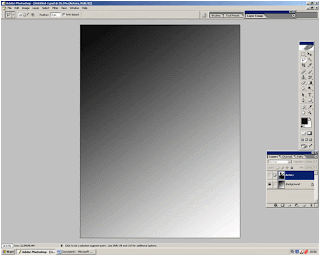
One of the ideas I had was to use a photo I took of the newspaper articles which were used as props in our trailer production. This would have provided another link between my campaign products. After careful consideration and comparison I decided that this would not be a suitable background as it had to much going on for a background used on a ‘Sight and Sound’ magazine cover.

I then went to the next extreme and tried out a plain black background. The reason in which I choose black for the colour of the background is in relation to the genre of our film trailer. The colours black and red are both common traits of our chosen genre horror and I felt it would be appropriate to continue these conventions on into my magazine cover. However I decided not to use this background because it was too plain and made the magazine cover layers look to separate.

I then experimented with the colour red as a background but it didn’t have the correct effect that I was looking for. It rather connoted the idea of passion.
It was from here that I remember that when using Photoshop there was a gradient tool which would be able to fade the colour. I first tried this with the black background and found that with the black fading to white was most effective. The reason for this being that there is very little going on in the background but it is not completely plain.

Monday, 12 April 2010
SWOT Web page
This is my SWOT analysis for my website page which is part of my individual coursework task. Here I will evaluate my strengths, weaknesses, opportunities and threats.
Strengths
*I am efficient at organising myself
*I am efficient at time management
*I am motivated
*I have created my magazine cover using the same software and have gained further experience
Weaknesses
*Limited knowledge of the software
*Only basic skills when using software
*Never produced a professional web page before
Opportunities
* My lecturer has provided workshops which provided me with my basic skills
* There is plenty of case study material to refer to
* My lecturer is available to me via email to answer any questions
* The software within college is of high standard and good quality
* Software in college is available on a number of computers
Threats
* My lack of knowledge and skills may mean that my product does not look professional
* My lack of knowledge and skill may mean that my product takes more time to produce than I have planned for
* My other subjects need just as much attention as my media coursework
Strengths
*I am efficient at organising myself
*I am efficient at time management
*I am motivated
*I have created my magazine cover using the same software and have gained further experience
Weaknesses
*Limited knowledge of the software
*Only basic skills when using software
*Never produced a professional web page before
Opportunities
* My lecturer has provided workshops which provided me with my basic skills
* There is plenty of case study material to refer to
* My lecturer is available to me via email to answer any questions
* The software within college is of high standard and good quality
* Software in college is available on a number of computers
Threats
* My lack of knowledge and skills may mean that my product does not look professional
* My lack of knowledge and skill may mean that my product takes more time to produce than I have planned for
* My other subjects need just as much attention as my media coursework
Wednesday, 7 April 2010
Progress Report- Production of Magazine Cover
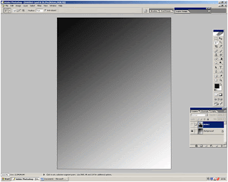
I started to create my magazine cover by opening up Photoshop and then going to file and then new. From here I proceeded to create my background. The way in which I did this was by using the paint bucket tool to fill the whole page black. I then made it fade from black to white was by using the gradient tool. I chose to have my background darker in the top left and then fade diagonally down. The reason for this is that I wanted my magazine cover to be mostly dark. This is a key convention of the genre horror. Also if fading the other way the photograph covers most of the dark colour and gives the magazine cover a different effect. Furthermore I chose the fade to be diagonal because it was most aesthetically pleasing.
Once I was satisfied with the background I then inserted the photograph which I had chosen to use as the main picture. It soon became evident that I would need to edit the photograph. The first thing I did was to use the magic wand tool to erase the upper half of the staircase as well as the photos original background. This was fairly simple due to the fact that the original background was cream whi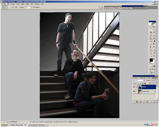 ch contrasted with the subjects and I knew from previous experience using Photoshop that a plain background made the use of the magic wand more effective.
The reason in which I erased the original background and upper staircase was because it would have been too large. Moreover I intended to crop my image and to do so effectively it was necessary for me to delete the background. Additionally to have used my original photograph background would have gone against the codes and conventions of ‘Sight and Sound’. I further went on to adjust the image’s size so that the character was not being covered up by the magazines title and place it on the left of the magazine cover. It is not a convention of ‘Sight and Sound’ to overlay the image on top of their brand name, so I avoided this.
My next step was to create a layer with the title and logo on. I obtained these images from the Internet and saved them to my pictures. I then opened them in Photoshop and used the magic wand tool to delete the background through the use of the inverse tool. The same process was used when developing the layer which contains the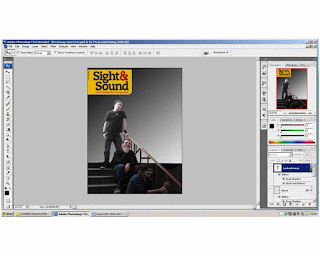 blood stain image which I also obtained from the Internet. I decided to use images from the Internet because they looked most effective and made my magazine cover look more professional. From examining front covers of ‘Sight and Sound’ I noticed that films with the genres horror or thriller did have specs of blood on them if it were appropriate. I felt that because our trailer depicts a knife as a weapon it would therefore be an appropriate code and convention to use on my own magazine cover.
I then went on to use the text tool in order to include the headlines. I have them set out so that they decrease in size as they descend down the page. I have settled on two styles of fonts and I use the serif for the headline and the non serif font as the sub heading. It is a convention of Sight and Sound to use a variety of serif and non serif fonts. To add to this all of the headlines are down the left hand side of the page, this is a convention of ‘Sigh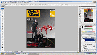 t and Sound’ another one is that they have considerable fewer headlines when compared to their competitors products such as ‘Empire’. After deciding where I would place the text and in what font I began to experiment with different effects. I have decided to use a drop shadow on the title of the film ‘Locked Away’ because it makes the text appear more 3D giving the magazine cover texture. Additionally I have used the bevel and emboss effect on the title ‘Locked Away’ because it to adds to the effect of being 3D adding texture.
Once I was satisfied with the background I then inserted the photograph which I had chosen to use as the main picture. It soon became evident that I would need to edit the photograph. The first thing I did was to use the magic wand tool to erase the upper half of the staircase as well as the photos original background. This was fairly simple due to the fact that the original background was cream whi
 ch contrasted with the subjects and I knew from previous experience using Photoshop that a plain background made the use of the magic wand more effective.
The reason in which I erased the original background and upper staircase was because it would have been too large. Moreover I intended to crop my image and to do so effectively it was necessary for me to delete the background. Additionally to have used my original photograph background would have gone against the codes and conventions of ‘Sight and Sound’. I further went on to adjust the image’s size so that the character was not being covered up by the magazines title and place it on the left of the magazine cover. It is not a convention of ‘Sight and Sound’ to overlay the image on top of their brand name, so I avoided this.
My next step was to create a layer with the title and logo on. I obtained these images from the Internet and saved them to my pictures. I then opened them in Photoshop and used the magic wand tool to delete the background through the use of the inverse tool. The same process was used when developing the layer which contains the
 blood stain image which I also obtained from the Internet. I decided to use images from the Internet because they looked most effective and made my magazine cover look more professional. From examining front covers of ‘Sight and Sound’ I noticed that films with the genres horror or thriller did have specs of blood on them if it were appropriate. I felt that because our trailer depicts a knife as a weapon it would therefore be an appropriate code and convention to use on my own magazine cover.
I then went on to use the text tool in order to include the headlines. I have them set out so that they decrease in size as they descend down the page. I have settled on two styles of fonts and I use the serif for the headline and the non serif font as the sub heading. It is a convention of Sight and Sound to use a variety of serif and non serif fonts. To add to this all of the headlines are down the left hand side of the page, this is a convention of ‘Sigh
 t and Sound’ another one is that they have considerable fewer headlines when compared to their competitors products such as ‘Empire’. After deciding where I would place the text and in what font I began to experiment with different effects. I have decided to use a drop shadow on the title of the film ‘Locked Away’ because it makes the text appear more 3D giving the magazine cover texture. Additionally I have used the bevel and emboss effect on the title ‘Locked Away’ because it to adds to the effect of being 3D adding texture.
Subscribe to:
Posts (Atom)