The two magazines in which I decided to examine as part of my research for my magazine cover are ‘Empire’ and ‘Sight and Sound’ these are two popular film magazines published within the UK. The fact that they are published in the UK is an important factor into the reason in which I chose them to examine. The reason for this being that my target audience for the trailer are British and are therefore likely to consume a British publication. The things in which I will be looking for on the editions are codes and conventions which feature regularly on the magazines.
EmpireEmpire magazine is produced by Bauer Consumer media and is Britain’s most popular film magazine. They tend to stick to main stream films which have generated the most media hype at the time. They focus mainly on the entertainment factors. Codes and conventions in general which occur over and over again on almost all issues of ‘Empire’ which I have noted are the fact that the title of the magazine is always in the same style of font regardless and almost always in the colour red. All fonts included on ‘Empire’ front covers are son serif fonts. The reason for this being that Bauer Consumer media have built themselves a respected brand which is recognised for its title. It has also been distinguished that the title is always placed at the top reading form left to right which is a common occurrence on many magazine covers produced for a western culture. Furthermore it is strategically placed there with regards to the rule of thirds and the power structures on the page. Additionally the magazine covers normally feature the main character of the film in a posed position placed on an active background background. This normally holds ties with the films genre. It is the film in which the character is featured in which sets the theme of the cover. This is normally based around the preconceived codes and conventions of genre. Additionally there are never more than 3 actors featured on the magazine cover at one time and traditionally it would appear that no props are used. Most of the time above the name of the magazine ‘Empire’ there is a statement made which links into the brand to make a sentence. For instance ‘Wolverine has returned for…EMPIRE’. One reason for this may be to create a sense of exclusiveness to ‘Empire’ as a magazine. Making the audience think that they have to buy it as they won’t be able to find anything like it in other competitor production.
My research into ‘Empire’ magazine has lead me to examine three different editions the first one being (January 2009 wolverine) one thing that strikes me instantly is the fact that the main character within the film is placed so he is overlapping the title. When considering other issues if this happens then the character is only ever entirely placed over the letter P of the title over letters may be covered but only slightly. Essentially the reason for this is the fact that even with the letter ‘P’
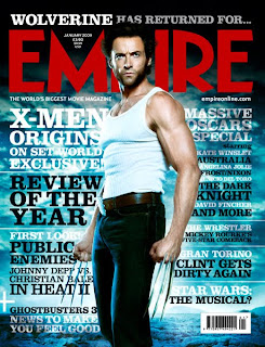
covered it is still possible to identify what magazine it is. The photo taken of the character is that of a mid long shot as you can see all but the bottom half of his legs. The reason for this being that the previous story line was that he was a mutant developed from human form. This picture demonstrates through mise-en-scene that he looks very similar to that of a human form. Another characteristic which strikes me is the fact that each cover features an actor from which ever film they are trying to exhibit in character in a posed position looking directly at the camera. Taking Althussers theory of interpellation into account this is an attribute of all ‘Empire’ magazines with regards to it calling out to its audience who subsequently go and buy it. This is the chief aim of the magazine producer. The sub head lines on the exemplar material are positioned both on the left and the right of the character. With the most important part of the information in a larger font and then almost a follow up summary beneath. However the titles positioned on the right hand side of the character are that of a smaller font which suggests there lesser importance as well as there position on the page with regards to the rule of thirds.
The next cover in which I studied was (September 2008 watchmen)
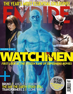
which confirms many of my previously assumed codes and conventions of the ‘Empire’ magazine. Although there are a few notable differences such as this cover features the maximum amount of 3 characters on the page. Throughout my research I have come across no editions with more than 3 characters featured. In comparison to the (January 2009 wolverine) edition it has very few sub headlines. The reason for this is because with 3 characters on the page there is already a lot going on. The main sub title used relates directly to the film visually advertised. Whereas the (January 2009 wolverine) edition has many captions not all of which are directly related to the film being advertised. The (September 2008 watchmen) again confirms the use of long mid shots as a convention of ‘Empire’ however I feel reason for this varies with regards to the previous example. I believe that the reason in which a mid to long shot has been used for this photo is to portray the characters power relationships with each other. As fundamentally with regards to the rule of thirds when applied to a magazine it would appear that the female character holds a large degree of power due to her position on the left of the page. However the centre and right positioned characters have the majority of their torsos showing which is an indication of their power as the left hand character is stood in a side position and you can see very little of her in comparison. Furthermore the centre character would appear to hold the most power as he is dominating the picture.
The last edition of ‘Empire’ in which I examined was the (January 2007 Spiderman)
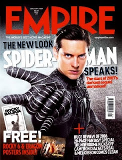
which once more did confirm many of the codes and conventions of ‘Empire’. Although the other hand this edition does not include a statement above the name of the magazine. However there is a statement below the name of the magazine. This still effectively gives the audience a sense of exclusiveness to ‘Empire’. Furthermore the photo taken is that of a mid shot rather than a long mid shot. The reason in which I feel this is done is to make the gaze of the actor more intense. With a mid shot it is easier for audiences to read the emotion portrayed on the face. In alikeness with The (September 2008 watchmen) edition the (January 2007 Spiderman) edition has very few subheadings. The reason I feel this is because the photo of the character is placed with regards to the rule of thirds in the most powerful position as it is believed that is where the eye is drawn to first. Therefore Empire is enhancing its importance by not surrounding it with other important information. Finally another convention of ‘Empire’ is that all the information about which number issue it is and the price is constantly placed between the dip in the ‘M’ in the brand title. This then allows for avid readers to know consistently where they will be able to find the said information about the issue.
Sight and Sound ‘Sight and Sound’ is a film magazine produced by the British Film Institute who role within the business is to provide features on all films on a wide scope. They tend to stick to social realist films and those not produced by Hollywood as they are largely covered by the mainstream magazines such as ‘Empire’ the reason for this being that they are obliged to do so as they are publicly funded. It not only reviews films but reports news from the film industry. Some of the subjects raised by social realist films are controversial and this therefore says a lot about the type of person in which they are attempting to target as there audience.
Obvious codes and conventions of ‘Sight and Sound’ include the fact that the title or brand of the magazine is always in black and red contained in a yellow box. The reason for this being that the British Film Institute have built themselves a respected brand which is recognised for its title. Additionally it is noted that the title is always in the top left of the magazine. With regards to western society this is what can be expected of many publication produced for western culture as this is the way in which western society reads. Again like its competitor product ‘Empire’ the title is strategically placed when considering the power structures on the page. With ‘Sight and Sound’ magazines this process is extremely evident as their title fits into the top left third of the magazine. The evidence of this is the fact that their title does not start at the very top of the page there is on all addition a border between the title and the top of the page. Also on all ‘Sight and Sound’ magazines since they underwent a new image have the bar code in the top right hand corner. Attached to this is the BFI (British Film Institute) logo. When compared to certain issues of ‘Empire’ it would appear that ‘Sight and Sound’ consistently have fewer sub captions and headlines surrounding its visual advertisement of the film. When further compared to ‘Empire’ and its background themes it can be said to use backgrounds with very little going on. Nevertheless the backgrounds used in editions of ‘Sight and Sound’ are textured.
My research into ‘Sight and Sound’ has lead me to look at 3 issues of the magazine the first being (August 2009 gangster special) edition.
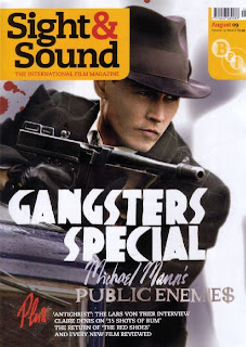
The actor on the front of the page is in character and posed. It has a large title placed in just below the middle of the page. It is in large bold lettering which establishes that it is fairly important to the selling point of the magazine as it is clear the producers want the audience to see it because of its size and colour. From examining the front covers of ‘Sight and Sound’ it has become evident that they use a wide and diverse range of fonts. This specific issue provides evidence of serif and son serif fonts. A reason for this could be because essentially when compared to ‘Empire’ backgrounds they have very little going on and a variety of fonts makes the front cover more aesthetically pleasing with regards to the use of mise-en-scene. Additionally another code and convention which occurs on a wide range of editions is the use of the sub heading ‘plus’ to instigate a list of features. This is one way in which they are able to keep the number of separate sub headings at a minimum.
The next edition is one which I took most inspiration from was (July 2009 Inglorious bastard) edition
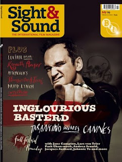
. The actor on this edition is in character and I posed looking directly at the camera. As mentioned as above in the research into ‘Empire’ taking Althussers theory of interpellation into account this is an attribute of it would appear most magazines as it gives the effect that the character is calling out to you personally. In essence this makes the audience want to go out and buy the magazine. This is just one way in which magazine producers incorporate to ensure that they make a profit. For a ‘Sight and Sound’ cover this edition uses a large amount of sub headings. However most of which are in a thin font which doesn’t really stand out and grab the reader’s attention. The reason for this being that they are important features which is evident through where they are placed with regards to the rule of thirds but that the name of the film ‘Inglorious Bastard’ is the hook in order to obtain the audiences interest. One thing in which I intend to use on my magazine front cover is the colour scheme featured on both of the above. The reason for this being that the colours used within these publications matches those of the codes and conventions for a horror film. Additionally each of the above covers appears to have representations of blood used as part of the mise-en-scene, in addition to the background and main photograph.
The final magazine cover in which I examined as a case study for the magazine ‘Sight and Sound’ is the (April 2009 cinematography special) edition.
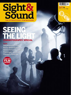
It would have appeared that from the two above editions of ‘Sight and Sound’ that I have chosen to research use mainly mid close up shots. Containing only one persona at a time. However this edition features a number of figures on the front page. It to like the (August 2009 gangster special) edition uses a limited amount of captions or sub titles. One reason for this may be due to the fact that there is a number of things happening within the photograph which is doubling as a background. On the other hand one thing in which I did note with regards to sub titles was the fact that they used people’s names to inform the reader. This suggests to me that ‘Sight and Sound’ have an avid audience who read as part of a routine. This fits nicely with what Foucault says about the narrative of the self and that consumerism of a certain media becomes almost a ritual. As a case study although it does not follow the codes and conventions for the shot size it does however confirm a number of other established codes and conventions. Something which I would further like to mention about the title of brand name of the magazine is the fact that it is in comparison to the other text it very much dominates the cover. Moreover another thing in which strikes me to be either a code or convention for the magazine ‘Sight and Sound’ is the fact that on every edition the sub headings are continuously on the left of the cover. This gives me an insight into the psychographic of the target audience. The text consistently being placed on the left hand side of the page indicates the importance of the text. Which pragmatically signifies that the magazine producer expects the target audience to read what is included within the magazine before they buy it.