First Blog
How Has My Creativity Developed Through Using Digital Technology
Additional Developments To My Creativity
Further Developments To My Creativity
How Is Your Contextual Understanding Developing Of The Media?
Audience Analysis For Viral Campaign Products
Group Coursework Paperwork- Trailer and Radio
Devising Teaser Trailer
Progress Report- Preproduction Trailer
Location Photographs
Analysis Of Filming 1
Revision Of Trailer Idea
Analysis Of Filming 2
Progress Report-Editing
Finished Trailer
Progress Report-Radio
Progress Report-Sound Studio
Finished Radio Advertisement For The Film ‘Locked Away’
Magazine Research
Sight and Sound
Magazine Draft
SWOT Magazine
Magazine Background Suggestions
Practice Magazine Cover
Magazine Planning Brief
Magazine Pre-production Progress Report
Magazine Production- Progress Report
Finished Magazine
Website Research
Web 2.0 And Its Development Of Collective Identity
Website Picture
SWOT website
Draft Website
Progress Report: Pre-production Website
Progress Report: Creating Website
Finished Website
Main Evaluation
Friday, 23 April 2010
Draft Magazine Cover

Here is a draft for the design of my magazine cover. Although I am aware that things may have to change, I would like things to remain pretty much the same.
Draft Website

Here is a draft of the design for my website. Although I am aware that things may have to change, I would like the design to remain pretty much the same.
Finished 'Locked Away' Trailer
Link to Trailer on YouTube
Here is the trailer that myself and the group made to promote the film ‘Locked Away’. Much detailed research and effort has gone into producing the final product. I am pleased with what we have achieved and I feel that the product fulfils its objective to promote the film ‘Locked Away’. The way that we have accomplished this is by incorporating many of the codes and conventions for the genre horror such as the use of close ups and emotive music. Without the use of the codes and conventions in my trailer I would not have been able to build a synergistic relationship between all of my viral campaign products.
OCR Copy Right Laws
Any use of music in this film complies with 'Fair Dealing' under the 1988 Copyright Designs and Patents Act (UK), Sections 6(i) and 6(ii); Fair dealing is a term used to describe some limited activities that are allowed without infringing copyright. Briefly these are as follows:Section 6i. Research and private studyCopying parts of a literary, dramatic, musical or artistic work or of a typographical arrangement of a published edition for the purpose of research or private study is allowed under the following conditions:· The copy is made for the purposes of research or private study.· The copy is made for non-commercial purposes.· The source of the material is acknowledged.· The person making the copy does not make copies of the material available for a number of people.ii Instruction or examinationCopying parts of a literary, dramatic, musical or artistic work or a sound recording, film or broadcast for the purpose of instruction or examination is allowed under the following conditions:· The copying is done by the student or the person giving instruction.· The copying is not done via a reprographic process.· The source of the material is acknowledged.· The instruction is for a non-commercial purpose.
Finished Website

Here is the website that I have produced as part of my viral campaign for the film ‘Locked Away’. I am very pleased with the way in which it has turned out and I feel that it is a valuable product within my viral campaign. When creating it in Photoshop it took less time than I had anticipated. The reason I feel this was because I had become more efficient when using the software. The research that I carried out into websites of films with the same genre informed me greatly with regards to the development of my website. I further feel that I have incorporated the use of the genres codes and conventions appropriately in order to produce a synergistic relationship between all my products.
Thursday, 22 April 2010
Finished Magazine Cover

Here is the magazine front cover that I have produced as part of my viral campaign for the film ‘Locked Away’. The research that I carried out in order to complete this product took more time than I had expected but I am pleased that I completed it as I found it very useful to refer back to in with reference to codes and conventions. These codes and conventions informed much of the design and development of the magazine cover. The actual making of the magazine front cover in Photoshop took less time than I had anticipated. I feel the reason for this being that many of the effects that I included could all be found in a similar way to the ones I had already established how to do. As a result of this the producing of my magazine cover maintained on schedule as each process counteracted the other. Overall I am very pleased with my magazine cover as an individual product as well as a product which is part of my viral campaign. I further feel that I have incorporated the use of the genres codes and conventions appropriately in order to produce a synergistic relationship between all my products.
Progress Report –Editing Trailer

After capturing all of the footage which we needed over a number of filming days it was time to begin the editing of the trailer. It was at this stage that we noticed a problem with some of our footage. Half of it was filmed in wide screen and half was not. This had created a letterbox effect on the footage which was not filmed in widescreen when we joined the footage together. This problem could have been avoided if we had checked that the settings had not been adjusted before we started. This was an unintentional error on our behalf which could have been avoided. At first we thought that our only option was to re film. This was a huge disappointment to the group as much of the footage we had obtained was of high quality and would have been a shame to have had to disregard it. Another problem with relfilming was time because the deadline was vastly approaching. To refilm would have been a hugely time costly process.
With much relief to the group we didn’t need to refilm as using the software Photoshop allowed us to create a similar letterbox affect on all of the widescreen footage. There was the danger of cutting the tops of people’s heads off however luckily this did not end up to be a problem because we had followed the rule of thirds guide well throughout our footage. Although evidently a problem I feel the group handled this well as everyone was willing to reschedule a filming day and cooperation was never a problem.
 It was also during the editing process that we decided that our trailer did not follow the horror convention of pace. As a result of this we referred back to our story boards in an attempt to fix this. However on paper as a group we were finding it hard to re order because essentially we liked our old order but it just didn’t work. As a group the way we found most effective in the process of re ordering shots was to use sticky labels with shot descriptions on them and to order them manually using a wall. Once this process was complete we had achieved our objective to quicken the end pace of our trailer in an appropriate way.
During the editing process we did have some successes. For instance the music and voiceovers were incorporated onto the trailer with no problems and through the use of fades and other effects we have been able to produce a trailer which is representative of the group’s hard work. The genre horror has many codes and conventions with regards to its style of editing and essentially we have been able to recreate many of these which all add to the tension building and enigma.
Wednesday, 21 April 2010
Main Evaluation
This year’s advanced portfolio has required me to produce a film trailer, radio advert, webpage and a magazine front cover. All of which are products to be included in a viral campaign to advertise the film ‘Locked Away’. Both the film trailer and the radio advert are group tasks and the webpage and magazine cover have been individual tasks. When producing my film trailer I have been able to refer back to my previous projects and this has been most useful with regards to using and developing codes and conventions for my chosen genre horror. However I had never produced a webpage or a magazine cover before so it has involved me expanding my knowledge and skills within the media industry.
There are many ways in which my products use, develop and challenge the codes and conventions of real media products. In order to establish these codes and conventions it was necessary for me and the group to firstly decide on a genre for the film in which our viral campaign will be advertising. Once this was determined such codes and conventions of the genre of the film could be applied to all of the products. The codes and conventions for the genre of the film have been very influential in the developing of the products.
With regards to the trailer much preproduction research went into identifying common codes and conventions of our chosen genre horror. One form of research which the group carried out was using YouTube to view trailers produced for cinematic viewing of popular horror films. The film trailers that we researched include ‘The Crazies’, 'Dawn of the Dead’ and 'The Hills Have Eyes’. All of which have had a large influential effect on the production of our trailer for the film ‘Locked Away’. Other film trailers were reviewed as part of the research process but it was carried out in less detail.
Immediately the first thing which strikes me as an important convention of all horror films is the camera work. It was noted by me and the group that within many horror films and their trailers there is a considerable amount of close ups used throughout them. Thus as a group we decided that it would be a vital convention to include within our own trailer. The reason for this being that it is the most intimate way of representing the characters emotion. Essentially as a media producer you want the audience to identify with the character because this helps to build a relationship between the audience and what is being represented on the screen making it more realistic. This helps to build the enigma which is what hooks the audience member and acts as an incentive to go and see the film in the cinema. Fundamentally this is the key objective of the media producer as the media is a business and its products need to make money. Within our own trailer as a group we have close ups strategically placed to either incite fear or help build enigma in particularly tense scenes. I was especially pleased with the way in which our trailer builds enigma through the use of close up camerawork.
Also with reference to camerawork our research informed us that the use of hand held camera work was very common and effective if appropriately used. To begin with personally I felt that the use of hand held camerawork would not be appropriate as my final product for the foundation portfolio was mostly filmed using it and I was not satisfied with our end result. However due to the fact that the majority of the group felt that the use of handheld camerawork would be most effective I was willing to try it. As I knew that if the shot did not turn out the way we had expected then both of them would be willing to experiment with me to improve the shot and achieve the effect we were aiming for. Additionally another reason why I was willing to attempt handheld footage was because since the foundation portfolio we have acquired more experience when using cameras and as a result of this our judgement over good and poor footage had improved. Through the use of similar styles of camerawork for our trailer it has resulted in the films genre being easily recognisable to audience members.
Here is my final opening sequence for the foundation portfolio
For me it was important to get the correct use of camera shots for the genre as my preliminary exercise during the foundation portfolio challenged many of them and effectively my product was misunderstood by the audience. The same could also be said for my foundation portfolio final piece as I feel we did not use enough of the correct shots and it was less effective than I would have hoped for. With reference to the trailer for my advanced portfolio I feel that with reference to the style of shots and camerawork that indeed our trailer builds enigma in the correct way for the genre horror.

As a group this was the way which we organised the sequecne of shots during the editing process
Another convention of editing in which we have used within our own trailer is the pace of a horror film trailer. It was distinguished that many horror film trailers started off fairly slowly setting the scene and then the pace quickens towards the end where much of the tension and enigma is built. The reason this is done is so that again the audience can build a relationship and identify with the characters. This helps make what is being represented on the screen more realistic to the audience and then when the pace quickens the actions, all the more shocking because they can personally identify with what is being represented. As a group we decided that we would use this method and in order to make this possible during the editing process we filmed each shot a number of times with long freezes with actors in character at the end of each one. This enabled our editor to produce a tightly edited product. This is how we have quickened the pace of the shots towards the end by cutting them so they only appear for a couple of seconds. With a film trailer this is an appropriate method of editing as shot sequences do not need to be in an order which makes sense. To begin with as a group we struggled to get our heads around this concept and it was necessary for us to re film with the objective of getting more footage. All in all though I am pleased with overall sequence of scenes because it makes our product less like an opening sequence and more like a trailer, which was our intension.
It was also during the editing process that we incorporated our credits. It was through the group’s research into trailers for horror movies that we established that there were certain codes and conventions for the order and their lexical styles. As the screen writer to begin with my initial idea was to have all of the credits at the beginning of the trailer however a group member pointed out to me that very rarely do all of the credits appear at the beginning they are strategically placed throughout the trailer. In agreement with him it was then that I began to consider the strategical placing of our credits. For instance I observed that the name of the film the trailer is advertising goes towards the end of the trailer. With this in mind it occurred that the reason for this would be because they want the audience to remember the title of the film. The objective of the trailer is to sell it to the audience. Another convention in which we have followed as a group with regards to the credits for the trailer is the colour codes which were dictated to us by the genre of the film. Throughout our credits are black with white text because these colours together make text easy to read at a glance. Furthermore the text which is contained on the screen starts midway down and only contains a few words. The reason for this being that we do not want to bombard the audience with too much information and it should be easy to read within a few seconds. The information which is included in the credits is all specifically selected to target an audience. For example we have included the names of some key actors which would appeal to audience members who see films containing certain actors because they like their previous work. As a group we have followed these conventions with regards to the credits because they are an ideal way of attracting specific audience members.
With consideration to mise-en-scene within our trailer for the film ‘Locked Away’ there are again many codes and conventions which we have applied to our product and developed. One thing that we attempted to recreate within our trailer is the use of poor lighting. This is used in horror films and trailers to help build enigma and tension through the idea of pathetic fallacy. However unfortunately we have in some scenes been able to create a representation of poor lighting essentially though it could be considered too dark. Additionally because we were unable to recreate it at all locations this can be considered a continuity error. Moreover we were relying on natural light and because we had to refilm shots on a number of occasions. There is very little we could have done about the difference in lighting.

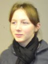
Here is a photograph of the cast to demonstrateage ranges within the college
Also in relation to mise-en-scene and codes and conventions it is true to say that with regards to actors and their physical appearances we did comply with that convention. The reason for this being that most college students are of the age which is commonly represented within horror films as the victims. This convention was easily achieved by the group as being college students ourselves we had a wide selection of people to ask to perform in our production. Moreover the actors selected were told to wear clothes that they would wear every day. This essentially should enable the audience to draw links with the characters and themselves as being ‘normal’ as they are all part of the same if not similar societal culture; this is one reason for us selecting college students as actors. To add to this the actors used within our film trailer share the same career status as the target audience. This again helps to build a relationship between the audience and what is being represented.
Additionally another convention in which we used and developed within our own trailer is the fact that throughout the trailer we do not reveal the identity of the antagonists. The reason we have done this is because it is a prime way to build enigma amongst the audience. As it is a common trait of human nature that we fear the unknown. Furthermore by not revealing the antagonists face it dehumanises the character which runs alongside the idea that his actions are not that of an average person. All of which helps to build the enigma further within our trailer.
Another code and convention of horror films is the use of a weapon in order to carry out the action. Society has inbuilt through our culture that weapons automatically indicate trouble and danger. For this reason picturing the knife in certain shots in the trailer have allowed us as media producers to incite this natural fear and therefore build enigma amongst the audience members.
This convention that we have used within our trailer especially applies to horror film trailers as it was noted that much of the footage contained in these trailers was acts of random chaos to shock and frighten the audience as they would not be expecting it. One way in which we developed this convention was by having a chair thrown down a flight of stairs in order to break the sequence of scenes up. It is an act of random chaos which the audience members would not be expecting. The reason we have used it is because it helps to break and increase tension and enigma and also produces an emotive response from the audience.
The use of emotive music and sound is a very valuable way in which media producers build enigma amongst the audience. As a group we decided that we to would recreate this process of building enigma in our own trailer. Fundamentally with consideration to sound this is another convention which we have used within our own product that was influenced by already existing media texts. Much effort has been put in by the group to produce a soundtrack which we have used as our emotive music. All of the music featured on our trailer is original and developed by a member of our group who experimented with tracks and presented them to the group who then decided on what would be most appropriate. The same can be said for the sound effects featured on our trailer. Each one was developed in the sound studio by the group. The reason why we decided to use music to build tension in our trailer is because we want our trailer to be interesting for the audience to watch as well as listen to. On a cinematic screen it would be amongst other trailers for other films and we wanted ours to stand out. As a group we did not feel that the use of silence would provide a similar effect as there is very little speech and some audience members may not interoperate our trailer correctly.
Finally a common convention of trailers in general is the use of a voiceover to narrate information for the audience. As a group we decided to incorporate a voice over into our own trailer. The reason for this being that it broadens our audiences as it would allow for somebody with impaired vision to enjoy our trailer as well. Furthermore audience members can filter what they want to see and by including the use of a voiceover it almost forces the audience to absorb the information.
It was imperative that our trailer included codes and conventions of the genre horror as it is through these that the audience recognise what is being represented to them. It is through codes and conventions that audience members establish whether or not they enjoy that particular genre of film. They essentially are what make a film successful and this is a primary aim of media text producers.
With consideration to my radio advertisement for the film ‘Locked Away’ many of the codes and conventions of sounds for the trailer can be applied to the sound conventions of the radio advertisement. However there are different legal restrictions in place for radio advertisements and these too form the basis for some of the codes and conventions.
This is certainly true for the use of sound effects. A legal requirement for a radio advertisement which applies especially to radio advertisements for horror films is that the uses of sudden loud sounds are prohibited. Often in horror film trailers there is use of sudden loud noises, these are used to provoke an emotional response from the audience. For our radio advertisement we would have to make any use of sound gradual.
 One convention in which the group decided to use was the use of emotive music to build enigma. It does this through the use of minor notes which enable the audience to identify with the genre. The music featured on our radio advertisement is the same as the sound track for our trailer and this draws links to our film trailer. The reason that we decided to use emotive music is because music is easily gradually introduced to a media text. This allowed us to use sound without breaking any advertising regulations. Secondly the use of emotive music is a common convention of the genre horror. On the other hand with consideration to sound and the genre horror another code and convention is the use of silence. As a group we decided that the use of silence on a radio advertisement would not be appropriate to advertise the film ‘Locked Away’ because within the actual trailer music is used and to then use silence might confuse the audience and they might not be able to draw the connection between the two products.
Furthermore another convention of radio in which we have used is the use of a voice over to provide the information about the film such as the date of release and title. The reason behind this being that people are more likely to remember certain information if they have been exposed to it a number of times. In essence as a group we have used the radio advertisement not only to advertise the film but all of the products produced for our viral campaigns. We have done this by including catch phrases from reviews by popular film magazines about the film ‘Locked Away’ and mentioning the website as a way to find out more about the film. The reason for this being that our task for the advanced portfolio was to produce a viral campaign and viral campaign products complement each other.
Additionally another convention of the radio which we have used on our radio advertisement is the fact that our certification for the film is featured at the very end of the product. The reason for this being that it is a key piece of information however due to the genre of the film audience members should already be able to establish that it will be an age restricted product. Also it was noted by the group that it is normally in a different voice from that of the voice over. In an attempt to recreate a product close to a real life product we decided to use a female voice to announce this.
When considering the codes and conventions of my magazine cover it would appear that they were governed firstly like all of the products I have created by the genre of the film and secondly by the conventions of the magazine itself. Through much research I decided that the best magazine brand to promote my film would be ‘Sight and Sound’ who have many conventions of their own which they follow as it helps establish the magazines brand. As a result of this it was necessary to incorporate the conventions of the genre in an appropriate style which fits in with the conventions of the brand of ‘Sight and Sound’.
One convention that I have used which is governed by the codes and conventions of the layout of ‘Sight and Sound’ is the fact that my photograph used to promote the film ‘Locked Away’ should not overlap the title or brand of the magazine. The reason for this being that the British Film Institute has built themselves a respected brand which is recognised for its title and it demonstrates the brands importance. Additionally it is noted that the title is always in the top left of the magazine. The reason for this being that western society reads from left to right and the power structures of the page are based upon this principle. It is due to this fact that I have tried to place my titles for my magazine cover in roughly the same position and this too could be considered a convention of ‘Sight and Sound’ which I have used.
To add to this another convention that I have used which was influenced by the codes and conventions of ‘Sight and Sound’ is the type of background I have used. It was noted by me that although fairly plain backgrounds were used they were not normally of a block colour. This is why I decided to use the gradient tool on Photoshop to have the colour fading. As this added some texture to the background and made it more aesthetically pleasing.
With focus still on the background, the colour was not informed through conventions of ‘Sight and Sound’ but by the film it is promptings genre. Effectively the mise-en-scene codes and conventions of the films genre horror have a large influence over the aesthetics of the cover. The c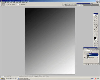 olours most readily associated with horror films are black, red and other dark colours. For this reason I decided to make the background black in order to fulfil a dark colour scheme. Fundamentally this will enable the audience to establish the genre of the film without having to read the magazine.
When compared to issues of ‘Empire’ it becomes apparent that ‘Sight and Sound’ use considerable fewer headings on their front covers. I have used this convention on my own product to help pursue the idea that my magazine cover is a real product. Another code and convention of ‘Sight and Sound’ which occurs on a wide range of editions is the use of the sub heading ‘plus’ to instigate a list of features. This is one way in which they are able to keep the number of separate sub headings at a minimum. I have included this on my magazine cover to help make by product look more realistic.
Unlike ‘Empire’, ‘Sight and Sound’ use a variety of serif and non serif fonts and as a result of this I have been able to use fonts that are most suited to the genre. Therefore it can be said that in relation to the fonts used on the magazine cover I have been able to follow the conventions of the genre horror.
Although the positioning and lexical style are both governed by the style of ‘Sight and Sound’ with regards to headings the colour of them is influenced by the genre of the film which it is promoting as well. It is due to the fact that my background is black that I have alternated between the use of the colour red and white. The reason for this being that they can be associated with the genre horror as a common convention and therefore I felt them to be most appropriate.
Moreover another convention of ‘Sight and Sound’ relates to the photograph used on the front cover. All of my research into my case study materials suggested that the photographs were taken of the actors on set in character. For this reason I have chosen a photograph where all of the actors are on set and in character. To add to this the photograph has quite obviously been posed for which would appear to be a convention of the photographs used by ‘Sight and Sound’ on their front covers. Again I have used this convention in order to make my product look more realistic to audience members.
Through the use of all the conventions governed by ‘Sight and Sound’ it has enabled me to produce a realistic representation of a magazine cover produced for the film magazine ‘Sight and Sound’. To add to this essentially any convention governed by the genre has informed the aesthetics of the magazine cover and formed the basis of conventions identifying the genre of the film it is promoting.
Finally when considering the codes and convention that I have used when designing my website aesthetically it can be said to have been influenced by the films genre. Similar to magazines websites have their own set of conventions to follow and they to have had an influence on the design of my website.
One convention of the genre horror that I have incorporated onto my own website is the use of a black and red colour scheme. These are common colour conventions of the genre horror. The reason I have included these colour into the colour scheme is so that audience members will instantly identify with the genre of the film that the website is promoting. Furthermore by using a similar colour scheme to that of my magazine draws links between the products as a viral campaign.
Again with regards to using conventions form the genre horror I have chosen to use a picture and have it central in black and white. The reason for this being that it desexualises the image and fu rthermore it makes the picture less of a dominant feature on the page. The reason for this being that I want the audience to be drawn towards the title of the film and the links about it.
A convention of websites in general which I have used on my website is the use individual links that navigate the user away from the home page in order to obtain extra information about the film. Additionally I have also included links to social networking sites that allow the audience to follow the progression of the film from production, distribution and exhibition. The reason I have included such links is because social networking sites are forums for the target audience to express a collective identity and discuss my film. They provide a valuable source of feedback.
The last convention which I have used has been influenced from real life media texts and therefore I feel it is a mixture of conventions from websites in general and that of the genre of the film. The convention that I have included is the use of credits at the bottom of the page. The reason this is included is because it is another attempt to attract an audience. As some audience members will go and see a film because of who it was produced by or acting in it because they have enjoyed their previous works.
Out of all of the task I have been required to complete creating the webpage has been the most challenging because essentially the genre informs the conventions for aesthetics and websites in general inform the convention of content. Yet essentially there are no rules about what not to do and there is a large degree of creativity involved when designing a website.
As a whole I am very pleased with the products I have produced for my viral campaign for the film ‘Locked Away’. I feel that because I have paid specific attention to the codes and conventions for each individual product that I have been able to produce a well organised and recognisable brand for the film ‘Locked Away’. Much of the synergistic relationships have been built using codes and convention s of the genre horror. The reason for this being that the trailer is the focal point of the viral campaign to advertise the film.
The first way in which I have been able to do this was by determining a play on words in relation to the synopsis to form the title of the film. From this as a group for our products that contained audio, we were able to link them through the sound effects of clattering keys. As this sparks connotations of the idea of being lock in. This audio track is featured on both our trailer and radio advertisement for the film ‘Locked Away’. The reason in which we developed this was because we were fully aware from the start that not all of our products would be able to be visually linked. To further our synergistic relationship between our products that contained audio we also developed a soundtrack which would act as the enigma building music within our trailer and radio advertisement.
Independently as well I felt that in order to link our radio advertisement with the rest of the campaign was important. So essentially I developed a script for it which mentioned both the possible magazine brands which members of the group were l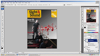 ikely to use and a communal website address.
In relation to a synergistic relationship built between the visual texts this was much more simply achieved. The reason for this being that the genre of a film being promoted predominately acts as the main influence with regards to anything aesthetically. All colour schemes and fonts can be seen to have influences in the films genre being promoted. For instance the colour scheme on both of my print texts this being my magazine cover and webpage all relate back to common association with horror films. As the colour red is the colour of blood and much blood is indicated to be split in our trailer and the colour black promotes this idea of evil and darkness. All of which are conventions for horror films. By using the same if not similar colour schemes allows an audience member to identify the films genre and then the film ‘Locked Away’. Additionally by using a similar colour scheme on my products creates continuity which further creates a synergistic relationship.
Another way in which a synergistic relationship has been built for my visual texts is simply the title of the film occurring on each one. Working in the same way is this idea that I have used a catch phrase from the voice over script ‘someone must pay’. Audience members will associate that catch phrase with my trailer for the film ‘Locked Away’ and fundamentally be drawn to go and see it at the cinema.
As a media producer I am aware that my products will come under criticism which should be taken as constructive. Since completing my viral campaign I have had some audience feed back and much of it has been positive however there are improvements that could be made to my products. The audience feed back which I received suggested that my magazine cover was not abstract enough to be that of a ‘Sight and Sound’ edition. They further went on to say that in their opinion they would not expect ‘Sight and Sound’ to promote such a film and felt that ‘Empire’ would have been a more suited brand for my campaign. As ‘Sight and Sound’ review films with more social realist approaches. Taking what they have said into consideration I would say that this comment is fair however I feel that with regards to the codes and conventions which I have used do not make the magazine cover look out of place from my other products for my viral campaign.
Generally speaking most of the people who passed judgement over my products as a whole viral campaign said that there was a clear synergistic relationship between them all and that they were able to establish the fact that they were all designed to promote the film ‘Locked Away’ as it was mentioned and visible on all the products. Additionally they stated that the colour scheme allowed them to identify with the genre of the film as the colours were commonly associated with the genre horror within society. Furthermore someone commented that I did not make the fact that the film was a certificate 15 clear enough on my auxiliary products.
Audience feed back is a valuable tool for media producers as it allows for them to receive first hand experiences of their products and they are able to indentify whether the product fulfilled the objectives it set out to do.
There are many things which I have learnt by taking my audience feed back into consideration. This includes the fact that it is important to include the certification of the film on my auxiliary products as otherwise it can be misconstrued that I am as a media producer with holding important information. Another thing which I have learnt form my audience feed back is the idea that many people have certain expectations of products and if your product does not meet these then it is unlikely you will be able to attract them as an audience. This is with specific reference to the comment about my magazine cover. To add to this my audience feed back has reinforced my knowledge that the use of codes and conventions is an important part when producing media texts as it is them that help the audience to identify what is being represented.
Throughout this entire process of completing my advanced portfolio I have used a number of media technologies. Starting right at the beginning essentially all of my research which I have carried out has only been possible through the use of web 2.0. as initially we spent much time researching teaser trailers for films of a similar genre and analysing them. YouTube has played a large part in this as not only does it exhibit the trailers it also has a forum for comments from audience members. This helped me to complete my advanced portfolio as it allowed me to obtain an insight into our potential target audiences preferences through there interaction in online reviews and comments as well as codes and conventions for my chosen genre horror.
Although for my magazine research some was carried out by examining real copies of the magazines much of my analysis came from viewing front covers of magazine from the internet. As well as accessing the home page sites of the magazines. In this way general use of the internet has enabled me to complete my advanced portfolio. With regards to general use of the internet and research into developing and planning my products such information as the regulations and legislation in terms of advertisement would have taken a lot longer to have found out about and therefore use of the internet has decreased the time in which I have been able to complete my advanced portfolio in.
With regards to research into websites the use of media technology has made the process e ntirely possible. Without the internet we would have no websites to examine and analyse. As a result of this it has aided me greatly in completing my advanced portfolio tasks.
When it comes to producing my products for my viral campaign the use of media technology has been vital and I have made us of it in many ways. In terms of the trailer firstly digital camera technology has made the process quicker and less costly as well as more efficient as it has allowed us to take many shots of the same scene, so that during the editing process we were able to choose which shot we as a group thought were best. Also on a digital camera there is a screen in which you are able to view what you have recorded. Allowing you to preview your work to see whether you like it or not. This is useful to use as it stops you deleting scenes you want. To add to this digital cameras are fairly light and portable meaning that as a group we were not restricted to where we could film and on many occasions the group were very thankful for this. There is also a function on the digital camera which allows the cameraman to delete any scene in which they do not want. Meaning that the memory on the film or camera is not wasted by unwanted scenes.
During the editing process again media technology plays a vital part as ‘Adobe Premiere’ is a new software which makes the editing process more efficient and effective. ‘Adobe Premiere’ has facilities which allow you to include special effects and has the ability to edit sound on the footage. This has enabled me to put together a well edited trailer from random clips of footage.
Additionally when creating my website and magazine cover the use of media technologies has been imperative as well as these tasks have required me to use the software ‘Photoshop’ which allows you to edit photographs taken on digital cameras (another form of technology which has aided my completion of the tasks) on a basis of layers which effectively are what magazine covers and websites are developed from. All of this has helped me to complete my advanced portfolio to the best of my ability through enabling me to use software which did not exist before hand.
Finally another major way in which media technologies have enabled me to complete my advanced portfolio is by providing me with a place in which I can exhibit my products. Websites such as blogger have provided me with an electronically way to submit my advanced portfolio and applications such as Google documents a place to store my work electronically. This has been very helpful as everything can be stored and organised in one place. Without it completing my advanced portfolio would not be resourceful as it would require a lot of paper and ink to produce paper copies. Fundamentally back to YouTube again it has provided me with a place to exhibit my trailer and other products in order for them to be viewed by the public.
Through my use of media technologies it has allowed me to produce products that represent my true ability without being costly or using up valuable resources. As well as allowing me to attempt things which I had not done before such as creating a webpage, a magazine cover and radio advertisement.
In conclusion I feel that the products that I have produced all fulfil their purpose within my viral campaign for the film ‘Locked Away’. All use appropriate codes and conventions for the genre horror and follow the conventions of their real life case study materials. The products compliment each other as a campaign but hold together as individual media texts. The synergistic relationship built between the products forms a strong basis for a successful viral campaign.
There are many ways in which my products use, develop and challenge the codes and conventions of real media products. In order to establish these codes and conventions it was necessary for me and the group to firstly decide on a genre for the film in which our viral campaign will be advertising. Once this was determined such codes and conventions of the genre of the film could be applied to all of the products. The codes and conventions for the genre of the film have been very influential in the developing of the products.
With regards to the trailer much preproduction research went into identifying common codes and conventions of our chosen genre horror. One form of research which the group carried out was using YouTube to view trailers produced for cinematic viewing of popular horror films. The film trailers that we researched include ‘The Crazies’, 'Dawn of the Dead’ and 'The Hills Have Eyes’. All of which have had a large influential effect on the production of our trailer for the film ‘Locked Away’. Other film trailers were reviewed as part of the research process but it was carried out in less detail.
Immediately
 the first thing which strikes me as an important convention of all horror films is the camera work. It was noted by me and the group that within many horror films and their trailers there is a considerable amount of close ups used throughout them. Thus as a group we decided that it would be a vital convention to include within our own trailer. The reason for this being that it is the most intimate way of representing the characters emotion. Essentially as a media producer you want the audience to identify with the character because this helps to build a relationship between the audience and what is being represented on the screen making it more realistic. This helps to build the enigma which is what hooks the audience member and acts as an incentive to go and see the film in the cinema. Fundamentally this is the key objective of the media producer as the media is a business and its products need to make money. Within our own trailer as a group we have close ups strategically placed to either incite fear or help build enigma in particularly tense scenes. I was especially pleased with the way in which our trailer builds enigma through the use of close up camerawork.
Also with reference to camerawork our research informed us
 that the use of hand held camera work was very common and effective if appropriately used. To begin with personally I felt that the use of hand held camerawork would not be appropriate as my final product for the foundation portfolio was mostly filmed using it and I was not satisfied with our end result. However due to the fact that the majority of the group felt that the use of handheld camerawork would be most effective I was willing to try it. As I knew that if the shot did not turn out the way we had expected then both of them would be willing to experiment with me to improve the shot and achieve the effect we were aiming for. Additionally another reason why I was willing to attempt handheld footage was because since the foundation portfolio we have acquired more experience when using cameras and as a result of this our judgement over good and poor footage had improved. Through the use of similar styles of camerawork for our trailer it has resulted in the films genre being easily recognisable to audience members.
Here is my final opening sequence for the foundation portfolio
For me it was important to get the correct use of camera shots for the genre as my preliminary exercise during the foundation portfolio challenged many of them and effectively my product was misunderstood by the audience. The same could also be said for my foundation portfolio final piece as I feel we did not use enough of the correct shots and it was less effective than I would have hoped for. With reference to the trailer for my advanced portfolio I feel that with reference to the style of shots and camerawork that indeed our trailer builds enigma in the correct way for the genre horror.

As a group this was the way which we organised the sequecne of shots during the editing process
Another convention of editing in which we have used within our own trailer is the pace of a horror film trailer. It was distinguished that many horror film trailers started off fairly slowly setting the scene and then the pace quickens towards the end where much of the tension and enigma is built. The reason this is done is so that again the audience can build a relationship and identify with the characters. This helps make what is being represented on the screen more realistic to the audience and then when the pace quickens the actions, all the more shocking because they can personally identify with what is being represented. As a group we decided that we would use this method and in order to make this possible during the editing process we filmed each shot a number of times with long freezes with actors in character at the end of each one. This enabled our editor to produce a tightly edited product. This is how we have quickened the pace of the shots towards the end by cutting them so they only appear for a couple of seconds. With a film trailer this is an appropriate method of editing as shot sequences do not need to be in an order which makes sense. To begin with as a group we struggled to get our heads around this concept and it was necessary for us to re film with the objective of getting more footage. All in all though I am pleased with overall sequence of scenes because it makes our product less like an opening sequence and more like a trailer, which was our intension.
It was also during the editing process that we incorporated our credits. It was through the group’s research into trailers for horror movies that we established that there were certain codes and conventions for the order and their lexical styles. As the screen writer to begin with my initial idea was to have all of the credits at the beginning of the trailer however a group member pointed out to me that very rarely do all of the credits appear at the beginning they are strategically placed throughout the trailer. In agreement with him it was then that I began to consider the strategical placing of our credits. For instance I observed that the name of the film the trailer is advertising goes towards the end of the trailer. With this in mind it occurred that the reason for this would be because they want the audience to remember the title of the film. The objective of the trailer is to sell it to the audience.
 Another convention in which we have followed as a group with regards to the credits for the trailer is the colour codes which were dictated to us by the genre of the film. Throughout our credits are black with white text because these colours together make text easy to read at a glance. Furthermore the text which is contained on the screen starts midway down and only contains a few words. The reason for this being that we do not want to bombard the audience with too much information and it should be easy to read within a few seconds. The information which is included in the credits is all specifically selected to target an audience. For example we have included the names of some key actors which would appeal to audience members who see films containing certain actors because they like their previous work. As a group we have followed these conventions with regards to the credits because they are an ideal way of attracting specific audience members.
With consideration to mise-en-scene within our trailer for the film ‘Locked Away’ there are again many codes and conventions which we have applied to our product and developed. One thing that we attempted to recreate within our trailer is the use of poor lighting. This is used in horror films and trailers to help build enigma and tension through the idea of pathetic fallacy. However unfortunately we have in some scenes been able to create a representation of poor lighting essentially though it could be considered too dark. Additionally because we were unable to recreate it at all locations this can be considered a continuity error. Moreover we were relying on natural light and because we had to refilm shots on a number of occasions. There is very little we could have done about the difference in lighting.

Here is a photograph of the cast to demonstrateage ranges within the college
Also in relation to mise-en-scene and codes and conventions it is true to say that with regards to actors and their physical appearances we did comply with that convention. The reason for this being that most college students are of the age which is commonly represented within horror films as the victims. This convention was easily achieved by the group as being college students ourselves we had a wide selection of people to ask to perform in our production. Moreover the actors selected were told to wear clothes that they would wear every day. This essentially should enable the audience to draw links with the characters and themselves as being ‘normal’ as they are all part of the same if not similar societal culture; this is one reason for us selecting college students as actors. To add to this the actors used within our film trailer share the same career status as the target audience. This again helps to build a relationship between the audience and what is being represented.
Additionally another convention in which we used and developed within our own trailer is the fact that throughout the trailer we do not reveal the identity of the antagonists. The reason we have done this is because it is a prime way to build enigma amongst the audience. As it is a common trait of human nature that we fear the unknown. Furthermore by not revealing the antagonists face it dehumanises the character which runs alongside the idea that his actions are not that of an average person. All of which helps to build the enigma further within our trailer.
Another code and convention of horror films is the use of
 a weapon in order to carry out the action. Society has inbuilt through our culture that weapons automatically indicate trouble and danger. For this reason picturing the knife in certain shots in the trailer have allowed us as media producers to incite this natural fear and therefore build enigma amongst the audience members.
This convention that we have used within our trailer especially applies to horror film trailers as it was noted that much of the footage contained in these trailers was acts of random chaos to shock and frighten the audience as they would not be expecting it. One way in which we developed this convention was by having a chair thrown down a flight of stairs in order to break the sequence of scenes up. It is an act of random chaos which the audience members would not be expecting. The reason we have used it is because it helps to break and increase tension and enigma and also produces an emotive response from the audience.
The use of emotive music and sound is a very valuable way in which media producers build enigma amongst the audience. As a group we decided that we to would recreate this process of building enigma in our own trailer. Fundamentally with consideration to sound this is another convention which we have used within our own product that was influenced by already existing media texts. Much effort has been put in by the group to produce a soundtrack which we have used as our emotive music. All of the music featured on our trailer is original and developed by a member of our group who experimented with tracks and presented them to the group who then decided on what would be most appropriate. The same can
 be said for the sound effects featured on our trailer. Each one was developed in the sound studio by the group. The reason why we decided to use music to build tension in our trailer is because we want our trailer to be interesting for the audience to watch as well as listen to. On a cinematic screen it would be amongst other trailers for other films and we wanted ours to stand out. As a group we did not feel that the use of silence would provide a similar effect as there is very little speech and some audience members may not interoperate our trailer correctly.
Finally a common convention of trailers in general is the use of a voiceover to narrate information for the audience. As a group we decided to incorporate a voice over into our own trailer. The reason for this being that it broadens our audiences as it would allow for somebody with impaired vision to enjoy our trailer as well. Furthermore audience members can filter what they want to see and by including the use of a voiceover it almost forces the audience to absorb the information.
It was imperative that our trailer included codes and conventions of the genre horror as it is through these that the audience recognise what is being represented to them. It is through codes and conventions that audience members establish whether or not they enjoy that particular genre of film. They essentially are what make a film successful and this is a primary aim of media text producers.
With consideration to my radio advertisement for the film ‘Locked Away’ many of the codes and conventions of sounds for the trailer can be applied to the sound conventions of the radio advertisement. However there are different legal restrictions in place for radio advertisements and these too form the basis for some of the codes and conventions.
This is certainly true for the use of sound effects. A legal requirement for a radio advertisement which applies especially to radio advertisements for horror films is that the uses of sudden loud sounds are prohibited. Often in horror film trailers there is use of sudden loud noises, these are used to provoke an emotional response from the audience. For our radio advertisement we would have to make any use of sound gradual.
 One convention in which the group decided to use was the use of emotive music to build enigma. It does this through the use of minor notes which enable the audience to identify with the genre. The music featured on our radio advertisement is the same as the sound track for our trailer and this draws links to our film trailer. The reason that we decided to use emotive music is because music is easily gradually introduced to a media text. This allowed us to use sound without breaking any advertising regulations. Secondly the use of emotive music is a common convention of the genre horror. On the other hand with consideration to sound and the genre horror another code and convention is the use of silence. As a group we decided that the use of silence on a radio advertisement would not be appropriate to advertise the film ‘Locked Away’ because within the actual trailer music is used and to then use silence might confuse the audience and they might not be able to draw the connection between the two products.
Furthermore another convention of radio in which we have used is the use of a voice over to provide the information about the film such as the date of release and title. The reason behind this being that people are more likely to remember certain information if they have been exposed to it a number of times. In essence as a group we have used the radio advertisement not only to advertise the film but all of the products produced for our viral campaigns. We have done this by including catch phrases from reviews by popular film magazines about the film ‘Locked Away’ and mentioning the website as a way to find out more about the film. The reason for this being that our task for the advanced portfolio was to produce a viral campaign and viral campaign products complement each other.
Additionally another convention of the radio which we have used on our radio advertisement is the fact that our certification for the film is featured at the very end of the product. The reason for this being that it is a key piece of information however due to the genre of the film audience members should already be able to establish that it will be an age restricted product. Also it was noted by the group that it is normally in a different voice from that of the voice over. In an attempt to recreate a product close to a real life product we decided to use a female voice to announce this.
When considering the codes and conventions of my magazine cover it would appear that they were governed firstly like all of the products I have created by the genre of the film and secondly by the conventions of the magazine itself. Through much research I decided that the best magazine brand to promote my film would be ‘Sight and Sound’ who have many conventions of their own which they follow as it helps establish the magazines brand. As a result of this it was necessary to incorporate the conventions of the genre in an appropriate style which fits in with the conventions of the brand of ‘Sight and Sound’.

One convention that I have used which is governed by the codes and conventions of the layout of ‘Sight and Sound’ is the fact that my photograph used to promote the film ‘Locked Away’ should not overlap the title or brand of the magazine. The reason for this being that the British Film Institute has built themselves a respected brand which is recognised for its title and it demonstrates the brands importance. Additionally it is noted that the title is always in the top left of the magazine. The reason for this being that western society reads from left to right and the power structures of the page are based upon this principle. It is due to this fact that I have tried to place my titles for my magazine cover in roughly the same position and this too could be considered a convention of ‘Sight and Sound’ which I have used.
To add to this another convention that I have used which was influenced by the codes and conventions of ‘Sight and Sound’ is the type of background I have used. It was noted by me that although fairly plain backgrounds were used they were not normally of a block colour. This is why I decided to use the gradient tool on Photoshop to have the colour fading. As this added some texture to the background and made it more aesthetically pleasing.
With focus still on the background, the colour was not informed through conventions of ‘Sight and Sound’ but by the film it is promptings genre. Effectively the mise-en-scene codes and conventions of the films genre horror have a large influence over the aesthetics of the cover. The c
 olours most readily associated with horror films are black, red and other dark colours. For this reason I decided to make the background black in order to fulfil a dark colour scheme. Fundamentally this will enable the audience to establish the genre of the film without having to read the magazine.
When compared to issues of ‘Empire’ it becomes apparent that ‘Sight and Sound’ use considerable fewer headings on their front covers. I have used this convention on my own product to help pursue the idea that my magazine cover is a real product. Another code and convention of ‘Sight and Sound’ which occurs on a wide range of editions is the use of the sub heading ‘plus’ to instigate a list of features. This is one way in which they are able to keep the number of separate sub headings at a minimum. I have included this on my magazine cover to help make by product look more realistic.
Unlike ‘Empire’, ‘Sight and Sound’ use a variety of serif and non serif fonts and as a result of this I have been able to use fonts that are most suited to the genre. Therefore it can be said that in relation to the fonts used on the magazine cover I have been able to follow the conventions of the genre horror.
Although the positioning and lexical style are both governed by the style of ‘Sight and Sound’ with regards to headings the colour of them is influenced by the genre of the film which it is promoting as well. It is due to the fact that my background is black that I have alternated between the use of the colour red and white. The reason for this being that they can be associated with the genre horror as a common convention and therefore I felt them to be most appropriate.
Moreover another convention of ‘Sight and Sound’ relates to the photograph
 used on the front cover. All of my research into my case study materials suggested that the photographs were taken of the actors on set in character. For this reason I have chosen a photograph where all of the actors are on set and in character. To add to this the photograph has quite obviously been posed for which would appear to be a convention of the photographs used by ‘Sight and Sound’ on their front covers. Again I have used this convention in order to make my product look more realistic to audience members.
Through the use of all the conventions governed by ‘Sight and Sound’ it has enabled me to produce a realistic representation of a magazine cover produced for the film magazine ‘Sight and Sound’. To add to this essentially any convention governed by the genre has informed the aesthetics of the magazine cover and formed the basis of conventions identifying the genre of the film it is promoting.
Finally when considering the codes and convention that I have used when designing my website aesthetically it can be said to have been influenced by the films genre. Similar to magazines websites have their own set of conventions to follow and they to have had an influence on the design of my website.
One convention of the genre horror that I have incorporated onto my own website is the use of a black and red colour scheme. These are common colour conventions of the genre horror. The reason I have included these colour into the colour scheme is so that audience members will instantly identify with the genre of the film that the website is promoting. Furthermore by using a similar colour scheme to that of my magazine draws links between the products as a viral campaign.
Again with regards to using conventions form the genre horror I have chosen to use a picture and have it central in black and white. The reason for this being that it desexualises the image and fu
A convention of websites in general which I have used on my website is the use individual links that navigate the user away from the home page in order to obtain extra information about the film. Additionally I have also included links to social networking sites that allow the audience to follow the progression of the film from production, distribution and exhibition. The reason I have included such links is because social networking sites are forums for the target audience to express a collective identity and discuss my film. They provide a valuable source of feedback.
The last convention which I have used has been influenced from real life media texts and therefore I feel it is a mixture of conventions from websites in general and that of the genre of the film. The convention that I have included is the use of credits at the bottom of the page. The reason this is included is because it is another attempt to attract an audience. As some audience members will go and see a film because of who it was produced by or acting in it because they have enjoyed their previous works.
Out of all of the task I have been required to complete creating the webpage has been the most challenging because essentially the genre informs the conventions for aesthetics and websites in general inform the convention of content. Yet essentially there are no rules about what not to do and there is a large degree of creativity involved when designing a website.
As a whole I am very pleased with the products I have produced for my viral campaign for the film ‘Locked Away’. I feel that because I have paid specific attention to the codes and conventions for each individual product that I have been able to produce a well organised and recognisable brand for the film ‘Locked Away’. Much of the synergistic relationships have been built using codes and convention s of the genre horror. The reason for this being that the trailer is the focal point of the viral campaign to advertise the film.
The first way in which I have been able to do this was by determining a play on words in relation to the synopsis to form the title of the film. From this as a group for our products that contained audio, we were able to link them through the sound effects of clattering keys. As this sparks connotations of the idea of being lock in. This audio track is featured on both our trailer and radio advertisement for the film ‘Locked Away’. The reason in which we developed this was because we were fully aware from the start that not all of our products would be able to be visually linked. To further our synergistic relationship between our products that contained audio we also developed a soundtrack which would act as the enigma building music within our trailer and radio advertisement.
Independently as well I felt that in order to link our radio advertisement with the rest of the campaign was important. So essentially I developed a script for it which mentioned both the possible magazine brands which members of the group were l
 ikely to use and a communal website address.
In relation to a synergistic relationship built between the visual texts this was much more simply achieved. The reason for this being that the genre of a film being promoted predominately acts as the main influence with regards to anything aesthetically. All colour schemes and fonts can be seen to have influences in the films genre being promoted. For instance the colour scheme on both of my print texts this being my magazine cover and webpage all relate back to common association with horror films. As the colour red is the colour of blood and much blood is
 indicated to be split in our trailer and the colour black promotes this idea of evil and darkness. All of which are conventions for horror films. By using the same if not similar colour schemes allows an audience member to identify the films genre and then the film ‘Locked Away’. Additionally by using a similar colour scheme on my products creates continuity which further creates a synergistic relationship.
Another way in which a synergistic relationship has been built for my visual texts is simply the title of the film occurring on each one. Working in the same way is this idea that I have used a catch phrase from the voice over script ‘someone must pay’. Audience members will associate that catch phrase with my trailer for the film ‘Locked Away’ and fundamentally be drawn to go and see it at the cinema.
As a media producer I am aware that my products will come under criticism which should be taken as constructive. Since completing my viral campaign I have had some audience feed back and much of it has been positive however there are improvements that could be made to my products. The audience feed back which I received suggested that my magazine cover was not abstract enough to be that of a ‘Sight and Sound’ edition. They further went on to say that in their opinion they would not expect ‘Sight and Sound’ to promote such a film and felt that ‘Empire’ would have been a more suited brand for my campaign. As ‘Sight and Sound’ review films with more social realist approaches. Taking what they have said into consideration I would say that this comment is fair however I feel that with regards to the codes and conventions which I have used do not make the magazine cover look out of place from my other products for my viral campaign.
Generally speaking most of the people who passed judgement over my products as a whole viral campaign said that there was a clear synergistic relationship between them all and that they were able to establish the fact that they were all designed to promote the film ‘Locked Away’ as it was mentioned and visible on all the products. Additionally they stated that the colour scheme allowed them to identify with the genre of the film as the colours were commonly associated with the genre horror within society. Furthermore someone commented that I did not make the fact that the film was a certificate 15 clear enough on my auxiliary products.
Audience feed back is a valuable tool for media producers as it allows for them to receive first hand experiences of their products and they are able to indentify whether the product fulfilled the objectives it set out to do.
There are many things which I have learnt by taking my audience feed back into consideration. This includes the fact that it is important to include the certification of the film on my auxiliary products as otherwise it can be misconstrued that I am as a media producer with holding important information. Another thing which I have learnt form my audience feed back is the idea that many people have certain expectations of products and if your product does not meet these then it is unlikely you will be able to attract them as an audience. This is with specific reference to the comment about my magazine cover. To add to this my audience feed back has reinforced my knowledge that the use of codes and conventions is an important part when producing media texts as it is them that help the audience to identify what is being represented.
Throughout this entire process of completing my advanced portfolio I have used a number of media technologies. Starting right at the beginning essentially all of my research which I have carried out has only been possible through the use of web 2.0. as initially
 we spent much time researching teaser trailers for films of a similar genre and analysing them. YouTube has played a large part in this as not only does it exhibit the trailers it also has a forum for comments from audience members. This helped me to complete my advanced portfolio as it allowed me to obtain an insight into our potential target audiences preferences through there interaction in online reviews and comments as well as codes and conventions for my chosen genre horror.
Although for my magazine research some was carried out by examining real copies of the magazines much of my analysis came from viewing front covers of magazine from the internet. As well as accessing the home page sites of the magazines. In this way general use of the internet has enabled me to complete my advanced portfolio. With regards to general use of the internet and research into developing and planning my products such information as the regulations and legislation in terms of advertisement would have taken a lot longer to have found out about and therefore use of the internet has decreased the time in which I have been able to complete my advanced portfolio in.
With regards to research into websites the use of media technology has made the process e
 ntirely possible. Without the internet we would have no websites to examine and analyse. As a result of this it has aided me greatly in completing my advanced portfolio tasks.
When it comes to producing my products for my viral campaign the use of media technology has been vital and I have made us of it in many ways. In terms of the trailer firstly digital camera technology has made the process quicker and less costly as well as more efficient as it has allowed us to take many shots of the same scene, so that during the editing process we were able to choose which shot we as a group thought were best. Also on a digital camera there is a screen in which you are able to view what you have recorded. Allowing you to preview your work to see whether you like it or not. This is useful to use as it stops you deleting scenes you want. To add to this digital cameras are fairly light and portable meaning that as a group we were not restricted to where we could film and on many occasions the group were very thankful for this. There is also a function on the digital camera which allows the cameraman to delete any scene in which they do not want. Meaning that the memory
 on the film or camera is not wasted by unwanted scenes.
During the editing process again media technology plays a vital part as ‘Adobe Premiere’ is a new software which makes the editing process more efficient and effective. ‘Adobe Premiere’ has facilities which allow you to include special effects and has the ability to edit sound on the footage. This has enabled me to put together a well edited trailer from random clips of footage.
Additionally when creating my website and magazine cover the use of media technologies has been imperative as well as these tasks have required me to use the software ‘Photoshop’ which allows you to edit photographs taken on digital cameras (another form of technology which has aided my completion of the tasks) on a basis of layers which effectively are what magazine covers and websites are developed from. All of this has helped me to complete my advanced portfolio to the best of my ability through enabling me to use software which did not exist before hand.
Finally another major way in which media technologies have enabled me to complete my advanced portfolio is by providing me with a place in which I can exhibit my products. Websites
Through my use of media technologies it has allowed me to produce products that represent my true ability without being costly or using up valuable resources. As well as allowing me to attempt things which I had not done before such as creating a webpage, a magazine cover and radio advertisement.
In conclusion I feel that the products that I have produced all fulfil their purpose within my viral campaign for the film ‘Locked Away’. All use appropriate codes and conventions for the genre horror and follow the conventions of their real life case study materials. The products compliment each other as a campaign but hold together as individual media texts. The synergistic relationship built between the products forms a strong basis for a successful viral campaign.
Tuesday, 20 April 2010
Progress Report- Creating the Webpage
The first thing I did after opening Photoshop was to go to new and set the settings to 800x800 as this is the size that a professional webpage would be designed on. Much of my pre production informed me that general codes and conventions for the genre horror should be applied to the website. With this in mind it formed the basis for the reason in which I chose to make the background black which further went on to influence the overall colour scheme of the webpage. To turn the background black I used the paint bucket and it gave me a block colour. 
I then opened up my chosen picture and made it black and white using the greyscale. The reason I did this was because it made the shine of the blade of the knife more prominent. Additionally when photographs are in black and white it desexualises the photograph and makes the audience pay more attention to the finer detail of the picture. I then used the elliptical marquee tool and made a circle around the part of the picture I wished to use.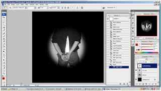 I subsequently had to change the feathering so that the picture merged with the background. I was particularly pleased with this effect and felt that the on the whole it was appropriate for the genre of the film as an accompanying product.
I then decided to include the title of the film. The rule of thirds influenced its positioning on the page because I needed to represent its importance in relation to the other information on the page. Furthermore again because I wanted to demonstrate the title of the films importance on the page I made the title a contrasting colour so that it stands out. Additionally I applied the bevel and emboss effect in order to give the title a 3D effect. This makes the title jump off the page and eye catching for the audience. This should aid the audience in remembering the title of the film.

I then opened up my chosen picture and made it black and white using the greyscale. The reason I did this was because it made the shine of the blade of the knife more prominent. Additionally when photographs are in black and white it desexualises the photograph and makes the audience pay more attention to the finer detail of the picture. I then used the elliptical marquee tool and made a circle around the part of the picture I wished to use.
 I subsequently had to change the feathering so that the picture merged with the background. I was particularly pleased with this effect and felt that the on the whole it was appropriate for the genre of the film as an accompanying product.
I then decided to include the title of the film. The rule of thirds influenced its positioning on the page because I needed to represent its importance in relation to the other information on the page. Furthermore again because I wanted to demonstrate the title of the films importance on the page I made the title a contrasting colour so that it stands out. Additionally I applied the bevel and emboss effect in order to give the title a 3D effect. This makes the title jump off the page and eye catching for the audience. This should aid the audience in remembering the title of the film.

The next step was to decide on the links that I would include on my webpage. The reason in which I decided on the ones that I have relates to the type of audience I am trying to attract. By including a link about the cast and crew demonstrates the fact that the audience members who go and see a film because of who directed it or because of who is starring in it are part of my target audience. Links such as news and downloads appeared a number of times on websites which I researched and as a result of this I decided to use them. In order to create a professional aspect to my website. The colour I have chosen and the font makes these links stand out enough for an audience member who is just browsing to stop them easily however I have not applied any effects because I don’t want them to become too dominant on the page.
After that I decided to use the shape tool to draw straight lines which appropriately encased the links. This again had the effect of making my website look more professional and it further gives the effect of a button. Which essentially I have included because one objective of my website is to inform the audience about the film ‘Locked Away’ and it encourages them to click on the link to find out more. Once I had drawn a set of lines which I was happy with I used the option copy to recreate each line which ensured that they were all identical.

Following this is the proceeded to create the credits at the bottom of my webpage. Like all of the text based information on my webpage I used the text tool to create it. I used a non serif font for the credits because such a font was featured on a number of web pages that I researched. Indicating that it is a convention of websites designed to advertise a film. I originally had the text colour as white however I thought that it was to bright against the black background. I experimented with the colour grey but this didn’t look right either. In the end I applied a bevel and emboss effect as well as an inward shadow and this produced my end result which I am pleased with as it dulled the colour of the credits. Making these credits took longer than I had expected because I decided to develop a style which I had seen used on one of case study materials. This meant that I had to create each word on a separate layer.

Once I had completed the credits and I was happy about where they were placed I decided to include social networking sites logos in order so audience members could follow the film. Much research has suggested that social networking sites are common places for a collective identity to develop. As it provides audience members with a forum to express ideas and opinions.

When taking a look at my webpage I felt as though something was missing. Reconsidering my case study materials it appeared to that the use of a slogan was a common convention featured on websites advertising films. It was here that I decided to include one of my own. I decided to use one of the voiceover slogans ‘someone must pay’ and incorporated it onto my webpage. I used the text tool to create it and decided to stick to the colour codes which I had developed for the website. I then used the bevel and emboss effect on the slogan again further creating links to the rest of the website.

To ensure that everything was lined up exactly the way I wanted when I was satisfied with the end product I used the line guides to match everything up. This has added a symmetrically affect to my webpage.

Radio Advertisment For The Film 'Locked Away'
Here is the group’s finished radio advertisement for the film ‘Locked Away’. The production and editing of the radio advertisement took less time than I would have expected. The software in which we used to record and edit the radio advert was much simpler than I would have expected. As a group we had booked the sound studio for a number of hours and our objectives were to just record the sound for it. However because we completed our objectives so quickly as a group we felt that an efficient use of our time would be to continue onto the editing process. By doing this it made it easier for the group to make decisions about the audio as within the sound studios there are speakers which allow us all to hear at the same time and discuss. Overall I am very pleased with our finished product and feel that the completion of this group task boosted the morale of the group.
Thursday, 15 April 2010
Progress Report Pre-Production Web Page
Having now completed my research into case study material for my webpage I am now looking to develop a draft or a plan of what I would like my webpage to look like. My research has provided me with information on codes and conventions as well as the sorts of information which are included on film promoting websites. Out of all of the tasks in which I have had to complete the research into websites has been the most challenging. The reason why I feel this has been the case is due to the fact that although websites for films of the same genre use similar codes and conventions there are many different items included on each different case study that I have looked at. Especially when you compare the layouts of websites to that of magazines. For instance for each magazine brand there is a certain layout style which you should follow, but with websites there are so many different things you can do. On the positive side this allows for a large degree of creativity when developing the website.
All of the websites that I looked at included a trailer preview for the film they were advertising. I am not going to include this on my own website because I feel the focus should be more about identifying and using correctly the codes and conventions. However if I were to take my advanced portfolio further this would be something I would consider including onto my website.
From examining my case study material it became clear that many of the codes and conventions used in both the trailer and the magazine cover can be identified on the webpage’s. All of which can be directly related to the genre of the film horror. For example the use of reds and blacks and other dark colours form the majority of the colour schemes in place on my case study materials. It was at this stage that I decided the use of serif fonts would be most appropriate for the film title and other film related information with regards to the genre of the film. However I do intend to use non serif fonts for the selection of information at the bottom of my website to help differentiate the information form the advertisement text.
I have completed an ideas blast of things which I need to include on my own webpage as part of its development as well as a SWOT analysis which has highlighted threats and weaknesses which I need to try and overcome in order for my website to be successful.
Website Research
In order to complete my advanced portfolio it is necessary for me to design and create a web page which will be part of my viral campaign and act as a further advertisement for the film ‘Locked Away’. The websites which I will look at are the webpage’s designed for ‘A Nightmare on Elm Street’, ‘The Hills Have Eyes’ and ‘Dawn of the Dead’. All of which have formed some influence in the making of the trailer.
‘A Nightmare on Elm Street’
Firstly when examining this webpage it is evident which genre the film it is advertising belongs to. The reason for this being that it follows the mise-en-scene colour conventions of reds and dark colours which are associated with the genre horro r. Also with regards to codes and conventions being indicators as to the genre of the film the same could also be said for the photograph as it is a close up of the actor in character which dominates the page. The use of close up camerawork is a common convention of horror films. To add to this you cannot see the full face of the antagonist this hides his identity which is another common convention of horror films. The link bar to things such as downloads is positioned at the top of the page in the centre. With regards to the rule of thirds it holds a fairly important position as they are either ways to make money or advertise the film which in the long run will make money. The reason for it holding such a dominant position is due to the fact that the production team’s priority is to make money. Also within the photograph the weapon is being held by the protagonist and it has a striking shine. This is something which I feel will be appropriate to use on my own personal webpage. The ‘A Nightmare on Elm Street’ website also has included on it a catch phrase which they have branded in order for the audience to associate it with the film. Through the groups use of a voice over on our trailer it would be suitable for me to take a phrase from it and use it on my website. The title of the fi
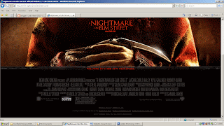 lm has been strategically placed in the centre of the page so that it is possible to see it at all times even when you scroll down. Being in the centre of the page it immediately grabs the audience’s attention and is one of the first and last things you see. This has been done because it means that the audience have more chance of remembering the title of the film. The date of the release of the film is also placed in the same general area. Additionally on the website there are links to social networking sites which are ways for the audience to meet people who share similar interests and opinions. It is also a way in which allows the audience to express a collective identity and forms a valuable tool for producers of new films of similar genres. As they are able to get ideas about demographic and psychographic factors for their own target audience. At the very bottom of the page is a selection of information such as the name of producer, editor and screen writer. The reason this is included is due to the fact that some audience members will go and see a film because of who it was produced by or acting in it because they have enjoyed their previous works. However because it is placed towards the bottom of the page suggests that it is not them whom the producers are directly targeting. This occurs on all of the websites which I have examined and would appear to be a convention of all film websites.
‘The Hills Have Eyes’
When comparing ‘The Hills Have Eyes’ webpage to the webpage for ‘A Nightmare on Elm Street’ to look at they are essentially different however many of the same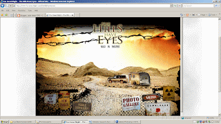 codes and conventions apply. For example the webpage still complies with the use of dark and red colours which helps the audience identify the genre of the film which it is advertising. Unlike the ‘A Nightmare On Elm Street’ webpage ‘The Hills Have Eyes’ webpage uses an illustration of the location where the film is set. One reason for this could be the fact that the film ‘The Hills Have Eyes’ holds strong pragmatics into the idea of isolation. This is another key convention of horror films. At the top of the page in the centre is the title of the film. With the illustration acting as a background the title position is very eye catching. It has had effects added to it such as an outer glow which all adds to its dominance on the page. The link bar included on ‘The Hills Have Eyes’ webpage has been integrated as part of the illustration. This draws links to the film and the website because it is a representatio
 n of the location in which the film was produced. Little things like this help the audience to draw connections between the products. This is essential for a viral campaign to be effective. The title of the film is included at the top of the webpage in the centre of the page. With regards to the rule of thirds the title of the film holds a fairly dominate position. Its dominance is highlighted through the use of an outer glow around the title which makes it eye catching and attention grabbing. The reason for this is that it is something which the producers want you to remember. At the bottom of the webpage is a selection of copyright laws and regulations. It does not include the names of cast or crew like ‘A Nightmare on Elm Street’ but this information is all included in the link bar. This suggests that ‘The Hills Have Eyes’ film is trying to directly target those audience members who go and see a film for its credentials such as the director or actors starring in it.
‘Dawn of the Dead’
Again like mentioned before all three of the webpage’s in which I have studied follow the codes and conventions of the mise-en-scene with consideration to c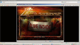 olour codes. The ‘Dawn of the Dead’ website uses black, red and various other dark colours. This instantly allows the audience to make associations to the genre of the film. The title of this film is placed in the top left hand corner of the website. Both the colour scheme and the titles font play on the film title’s word dawn. The letters in the top left hand corner are stretched and this gives the effect of a shadow. By incorporating such ideas it provides a link for the audience to the film and the rest of its products. Having the title of the film at the top with a glow around the letters makes it eye catching and attention grabbing. This supports the idea that this is what the web page designers want you to remember. On the right hand side of the page is the links bar which includes things such as ‘about the film’ and ‘photographs’ with regards to the rule of thirds they would appear to hold a weak position and your attention is more directly placed on the slogan which is positioned directly in the centre of the website. Something which has been included on this website for the film ‘Dawn of the Dead’ is above the link bar there are more links to games and other information about movies of a similar genre. This indicates that one of the psychographic factors of their target audience was an already existing interest in zombie horror films. When compared to ‘The Hills Have Eyes’ and ‘A Nightmare on Elm Street’ websites it would appear that there are no copy right laws and regulations or selected information on actors, directors and this then supports the idea that the main people who they are targeting are those already with a pre existing interest in zombie films. One thing which does strikes me about this website is that the website fits onto one screen and there is no need for a scroll bar. This makes things easier for the audience as they can see all of the information at once. Also included on this webpage is an advertisement for a spinoff of the film ‘Shaun of the Dead’. This advocates that this website has been altered since the release date of the film and therefore information may have been altered or removed.
In conclusion from my research I can see that the websites for each film all follow a set of codes and conventions all linked to the genre of the film that they are advertising. I can further see that although following many of the same codes and conventions that each individual web page is different. This has granted me with a degree of creativity with what I will do to produce my own web page. However it is from this research that I have been able to determine a colour scheme for my website and the positioning of certain information. It has also helped me by providing me with examples of information which needs to be included.
‘A Nightmare on Elm Street’
Firstly when examining this webpage it is evident which genre the film it is advertising belongs to. The reason for this being that it follows the mise-en-scene colour conventions of reds and dark colours which are associated with the genre horro
 r. Also with regards to codes and conventions being indicators as to the genre of the film the same could also be said for the photograph as it is a close up of the actor in character which dominates the page. The use of close up camerawork is a common convention of horror films. To add to this you cannot see the full face of the antagonist this hides his identity which is another common convention of horror films. The link bar to things such as downloads is positioned at the top of the page in the centre. With regards to the rule of thirds it holds a fairly important position as they are either ways to make money or advertise the film which in the long run will make money. The reason for it holding such a dominant position is due to the fact that the production team’s priority is to make money. Also within the photograph the weapon is being held by the protagonist and it has a striking shine. This is something which I feel will be appropriate to use on my own personal webpage. The ‘A Nightmare on Elm Street’ website also has included on it a catch phrase which they have branded in order for the audience to associate it with the film. Through the groups use of a voice over on our trailer it would be suitable for me to take a phrase from it and use it on my website. The title of the fi
 lm has been strategically placed in the centre of the page so that it is possible to see it at all times even when you scroll down. Being in the centre of the page it immediately grabs the audience’s attention and is one of the first and last things you see. This has been done because it means that the audience have more chance of remembering the title of the film. The date of the release of the film is also placed in the same general area. Additionally on the website there are links to social networking sites which are ways for the audience to meet people who share similar interests and opinions. It is also a way in which allows the audience to express a collective identity and forms a valuable tool for producers of new films of similar genres. As they are able to get ideas about demographic and psychographic factors for their own target audience. At the very bottom of the page is a selection of information such as the name of producer, editor and screen writer. The reason this is included is due to the fact that some audience members will go and see a film because of who it was produced by or acting in it because they have enjoyed their previous works. However because it is placed towards the bottom of the page suggests that it is not them whom the producers are directly targeting. This occurs on all of the websites which I have examined and would appear to be a convention of all film websites.
‘The Hills Have Eyes’
When comparing ‘The Hills Have Eyes’ webpage to the webpage for ‘A Nightmare on Elm Street’ to look at they are essentially different however many of the same
 codes and conventions apply. For example the webpage still complies with the use of dark and red colours which helps the audience identify the genre of the film which it is advertising. Unlike the ‘A Nightmare On Elm Street’ webpage ‘The Hills Have Eyes’ webpage uses an illustration of the location where the film is set. One reason for this could be the fact that the film ‘The Hills Have Eyes’ holds strong pragmatics into the idea of isolation. This is another key convention of horror films. At the top of the page in the centre is the title of the film. With the illustration acting as a background the title position is very eye catching. It has had effects added to it such as an outer glow which all adds to its dominance on the page. The link bar included on ‘The Hills Have Eyes’ webpage has been integrated as part of the illustration. This draws links to the film and the website because it is a representatio
 n of the location in which the film was produced. Little things like this help the audience to draw connections between the products. This is essential for a viral campaign to be effective. The title of the film is included at the top of the webpage in the centre of the page. With regards to the rule of thirds the title of the film holds a fairly dominate position. Its dominance is highlighted through the use of an outer glow around the title which makes it eye catching and attention grabbing. The reason for this is that it is something which the producers want you to remember. At the bottom of the webpage is a selection of copyright laws and regulations. It does not include the names of cast or crew like ‘A Nightmare on Elm Street’ but this information is all included in the link bar. This suggests that ‘The Hills Have Eyes’ film is trying to directly target those audience members who go and see a film for its credentials such as the director or actors starring in it.
‘Dawn of the Dead’
Again like mentioned before all three of the webpage’s in which I have studied follow the codes and conventions of the mise-en-scene with consideration to c
 olour codes. The ‘Dawn of the Dead’ website uses black, red and various other dark colours. This instantly allows the audience to make associations to the genre of the film. The title of this film is placed in the top left hand corner of the website. Both the colour scheme and the titles font play on the film title’s word dawn. The letters in the top left hand corner are stretched and this gives the effect of a shadow. By incorporating such ideas it provides a link for the audience to the film and the rest of its products. Having the title of the film at the top with a glow around the letters makes it eye catching and attention grabbing. This supports the idea that this is what the web page designers want you to remember. On the right hand side of the page is the links bar which includes things such as ‘about the film’ and ‘photographs’ with regards to the rule of thirds they would appear to hold a weak position and your attention is more directly placed on the slogan which is positioned directly in the centre of the website. Something which has been included on this website for the film ‘Dawn of the Dead’ is above the link bar there are more links to games and other information about movies of a similar genre. This indicates that one of the psychographic factors of their target audience was an already existing interest in zombie horror films. When compared to ‘The Hills Have Eyes’ and ‘A Nightmare on Elm Street’ websites it would appear that there are no copy right laws and regulations or selected information on actors, directors and this then supports the idea that the main people who they are targeting are those already with a pre existing interest in zombie films. One thing which does strikes me about this website is that the website fits onto one screen and there is no need for a scroll bar. This makes things easier for the audience as they can see all of the information at once. Also included on this webpage is an advertisement for a spinoff of the film ‘Shaun of the Dead’. This advocates that this website has been altered since the release date of the film and therefore information may have been altered or removed.
In conclusion from my research I can see that the websites for each film all follow a set of codes and conventions all linked to the genre of the film that they are advertising. I can further see that although following many of the same codes and conventions that each individual web page is different. This has granted me with a degree of creativity with what I will do to produce my own web page. However it is from this research that I have been able to determine a colour scheme for my website and the positioning of certain information. It has also helped me by providing me with examples of information which needs to be included.
Wednesday, 14 April 2010
Website Picture

This is the picture which I have decided to use for my website. My intension is to have it positioned in the centre of the page with the title of the film above it. Although happy with the picture I am going to edit it in a number of ways. This will include making the photograph appear to have an oval outline. Further editing will include removing a smear on the lens of the camera which I visible on the photograph. I will also turn the photograph black and white as this desexualises the picture. I feel this is appropriate as the photograph is that of the antagonist. Moreover when in black and white the shine from the blade of the knife is more striking.
I have chosen this picture for a number of reasons; firstly it is of the antagonist in character with the knife behind his back. This reiterates the innocence of the protagonists as they are unaware about what is happening. Additionally this helps to build enigma and suspense. This is a common convention of horror movies. Another reason that I chose this photograph is because it has been taken so that it is not possible to see the antagonists head. This devises a link between the trailer and my website as throughout the trailer the identity of the antagonist is never revealed. This provides a hook which will entice audience members to go and see the film to find out who it is.
Magazine Background suggestions
When completing my magazine research I became aware that neither Sight and Sound or Empire used the main photos background. It was from examining these magazine covers that I developed a few ideas about what I would use as a background. Once I had established which magazine I would use as an influence the decision over what style of background I would use became simpler. It was noted that ‘Sight and Sound’ used fairly plain backgrounds for their front covers.
One of the ideas I had was to use a photo I took of the newspaper articles which were used as props in our trailer production. This would have provided another link between my campaign products. After careful consideration and comparison I decided that this would not be a suitable background as it had to much going on for a background used on a ‘Sight and Sound’ magazine cover.
I then went to the next extreme and tried out a plain black background. The reason in which I choose black for the colour of the background is in relation to the genre of our film trailer. The colours black and red are both common traits of our chosen genre horror and I felt it would be appropriate to continue these conventions on into my magazine cover. However I decided not to use this background because it was too plain and made the magazine cover layers look to separate.
I then experimented with the colour red as a background but it didn’t have the correct effect that I was looking for. It rather connoted the idea of passion.
It was from here that I remember that when using Photoshop there was a gradient tool which would be able to fade the colour. I first tried this with the black background and found that with the black fading to white was most effective. The reason for this being that there is very little going on in the background but it is not completely plain.
One of the ideas I had was to use a photo I took of the newspaper articles which were used as props in our trailer production. This would have provided another link between my campaign products. After careful consideration and comparison I decided that this would not be a suitable background as it had to much going on for a background used on a ‘Sight and Sound’ magazine cover.

I then went to the next extreme and tried out a plain black background. The reason in which I choose black for the colour of the background is in relation to the genre of our film trailer. The colours black and red are both common traits of our chosen genre horror and I felt it would be appropriate to continue these conventions on into my magazine cover. However I decided not to use this background because it was too plain and made the magazine cover layers look to separate.

I then experimented with the colour red as a background but it didn’t have the correct effect that I was looking for. It rather connoted the idea of passion.
It was from here that I remember that when using Photoshop there was a gradient tool which would be able to fade the colour. I first tried this with the black background and found that with the black fading to white was most effective. The reason for this being that there is very little going on in the background but it is not completely plain.

Monday, 12 April 2010
SWOT Web page
This is my SWOT analysis for my website page which is part of my individual coursework task. Here I will evaluate my strengths, weaknesses, opportunities and threats.
Strengths
*I am efficient at organising myself
*I am efficient at time management
*I am motivated
*I have created my magazine cover using the same software and have gained further experience
Weaknesses
*Limited knowledge of the software
*Only basic skills when using software
*Never produced a professional web page before
Opportunities
* My lecturer has provided workshops which provided me with my basic skills
* There is plenty of case study material to refer to
* My lecturer is available to me via email to answer any questions
* The software within college is of high standard and good quality
* Software in college is available on a number of computers
Threats
* My lack of knowledge and skills may mean that my product does not look professional
* My lack of knowledge and skill may mean that my product takes more time to produce than I have planned for
* My other subjects need just as much attention as my media coursework
Wednesday, 7 April 2010
Progress Report- Production of Magazine Cover

I started to create my magazine cover by opening up Photoshop and then going to file and then new. From here I proceeded to create my background. The way in which I did this was by using the paint bucket tool to fill the whole page black. I then made it fade from black to white was by using the gradient tool. I chose to have my background darker in the top left and then fade diagonally down. The reason for this is that I wanted my magazine cover to be mostly dark. This is a key convention of the genre horror. Also if fading the other way the photograph covers most of the dark colour and gives the magazine cover a different effect. Furthermore I chose the fade to be diagonal because it was most aesthetically pleasing.
Once I was satisfied with the background I then inserted the photograph which I had chosen to use as the main picture. It soon became evident that I would need to edit the photograph. The first thing I did was to use the magic wand tool to erase the upper half of the staircase as well as the photos original background. This was fairly simple due to the fact that the original background was cream whi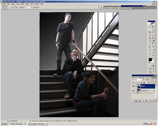 ch contrasted with the subjects and I knew from previous experience using Photoshop that a plain background made the use of the magic wand more effective.
The reason in which I erased the original background and upper staircase was because it would have been too large. Moreover I intended to crop my image and to do so effectively it was necessary for me to delete the background. Additionally to have used my original photograph background would have gone against the codes and conventions of ‘Sight and Sound’. I further went on to adjust the image’s size so that the character was not being covered up by the magazines title and place it on the left of the magazine cover. It is not a convention of ‘Sight and Sound’ to overlay the image on top of their brand name, so I avoided this.
My next step was to create a layer with the title and logo on. I obtained these images from the Internet and saved them to my pictures. I then opened them in Photoshop and used the magic wand tool to delete the background through the use of the inverse tool. The same process was used when developing the layer which contains the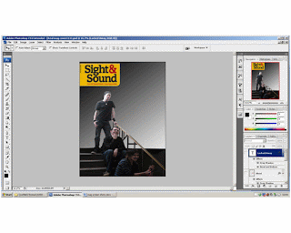 blood stain image which I also obtained from the Internet. I decided to use images from the Internet because they looked most effective and made my magazine cover look more professional. From examining front covers of ‘Sight and Sound’ I noticed that films with the genres horror or thriller did have specs of blood on them if it were appropriate. I felt that because our trailer depicts a knife as a weapon it would therefore be an appropriate code and convention to use on my own magazine cover.
I then went on to use the text tool in order to include the headlines. I have them set out so that they decrease in size as they descend down the page. I have settled on two styles of fonts and I use the serif for the headline and the non serif font as the sub heading. It is a convention of Sight and Sound to use a variety of serif and non serif fonts. To add to this all of the headlines are down the left hand side of the page, this is a convention of ‘Sigh t and Sound’ another one is that they have considerable fewer headlines when compared to their competitors products such as ‘Empire’. After deciding where I would place the text and in what font I began to experiment with different effects. I have decided to use a drop shadow on the title of the film ‘Locked Away’ because it makes the text appear more 3D giving the magazine cover texture. Additionally I have used the bevel and emboss effect on the title ‘Locked Away’ because it to adds to the effect of being 3D adding texture.
Once I was satisfied with the background I then inserted the photograph which I had chosen to use as the main picture. It soon became evident that I would need to edit the photograph. The first thing I did was to use the magic wand tool to erase the upper half of the staircase as well as the photos original background. This was fairly simple due to the fact that the original background was cream whi
 ch contrasted with the subjects and I knew from previous experience using Photoshop that a plain background made the use of the magic wand more effective.
The reason in which I erased the original background and upper staircase was because it would have been too large. Moreover I intended to crop my image and to do so effectively it was necessary for me to delete the background. Additionally to have used my original photograph background would have gone against the codes and conventions of ‘Sight and Sound’. I further went on to adjust the image’s size so that the character was not being covered up by the magazines title and place it on the left of the magazine cover. It is not a convention of ‘Sight and Sound’ to overlay the image on top of their brand name, so I avoided this.
My next step was to create a layer with the title and logo on. I obtained these images from the Internet and saved them to my pictures. I then opened them in Photoshop and used the magic wand tool to delete the background through the use of the inverse tool. The same process was used when developing the layer which contains the
 blood stain image which I also obtained from the Internet. I decided to use images from the Internet because they looked most effective and made my magazine cover look more professional. From examining front covers of ‘Sight and Sound’ I noticed that films with the genres horror or thriller did have specs of blood on them if it were appropriate. I felt that because our trailer depicts a knife as a weapon it would therefore be an appropriate code and convention to use on my own magazine cover.
I then went on to use the text tool in order to include the headlines. I have them set out so that they decrease in size as they descend down the page. I have settled on two styles of fonts and I use the serif for the headline and the non serif font as the sub heading. It is a convention of Sight and Sound to use a variety of serif and non serif fonts. To add to this all of the headlines are down the left hand side of the page, this is a convention of ‘Sigh
 t and Sound’ another one is that they have considerable fewer headlines when compared to their competitors products such as ‘Empire’. After deciding where I would place the text and in what font I began to experiment with different effects. I have decided to use a drop shadow on the title of the film ‘Locked Away’ because it makes the text appear more 3D giving the magazine cover texture. Additionally I have used the bevel and emboss effect on the title ‘Locked Away’ because it to adds to the effect of being 3D adding texture.
Subscribe to:
Posts (Atom)